The Administrative Struggle Of A Freelancer
Over the past years, the global workforce has shifted remarkably. People have become more independent which has lead to a significant growth of the freelancer market. As freelancing provides freedom, independency and flexibility, it has become particularly attractive to younger generations. Therefore, the market of freelancers is expected to grow steadily also in the coming years.
Nonetheless, people that are new to freelancing don't always realize how much administration it actually requires. On average, a freelancers spends 33-45% of their time on administrative work. When I began my journey as a freelancer, I was facing the exact same problem and it was extremely frustrating. The last thing you’d like to do is to spend an entire day working on administrative tasks. One of the reasons you decided to become a freelancer was because you like the creative process behind your job. This leads to the following question: How can you increase your time for creativity and decrease the administrative role you play in your business?
I felt that this problem could be solved by building a digital product - an app - that simplifies the administration of freelancers. Thus, allowing them to spend more time on the actual projects, and ultimately, resulting in a more successful business. As this being the main USP (Unique Selling Proposition) of this management tool, freelancers would be willing to pay for this service since it directly affects their income. Additionally, I believe that the product's clear and transparent structure could reduce the entry barrier to becoming a freelancer, hence expending our potential market.
To be the most effective business, we need to know who we are selling to.
Target Segments
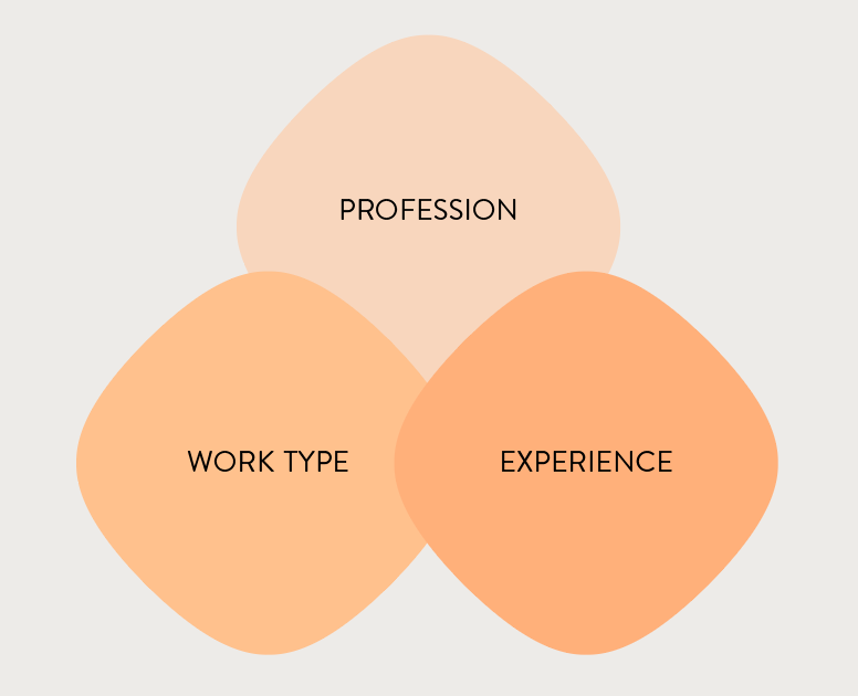
Based on my research, I set up three classifications which I think will help us to define the different groups of freelancers as well as their specific needs.
Profession
Designer, Developer, Photographer, Consultants, etc.
Work Type
Full-time, Part-time, Retainer contract
Experience
Beginner, Intermediate, Expert
Through The Customer's Lens
To understand how our customers, the freelancers, find and interact with the service created, I looked at the product through the lens of a customer.
Comprehending the customer's context and needs
By connecting with our customers, I quickly realized that each step of their business operations is linked with different emotions. The user - the freelancer - could be very excited to have won a new client, yet a moment later, be frustrated that they have to cancel another project. Hence, it is vital to communicate appropriately with the user at each of these steps to celebrate their success, to cheer them up respectively.
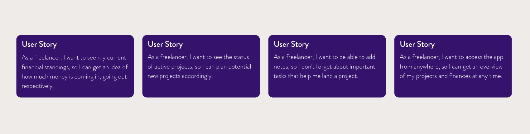
Since freelancers spend most of their work time in front of a screen in various locations - at home, in airports or coffee shops - I felt as if they would not only appreciate to manage their business on a web app but also on a mobile app from their smartphones. This assumption was confirmed by conducting a small amount of interviews with other freelancers.
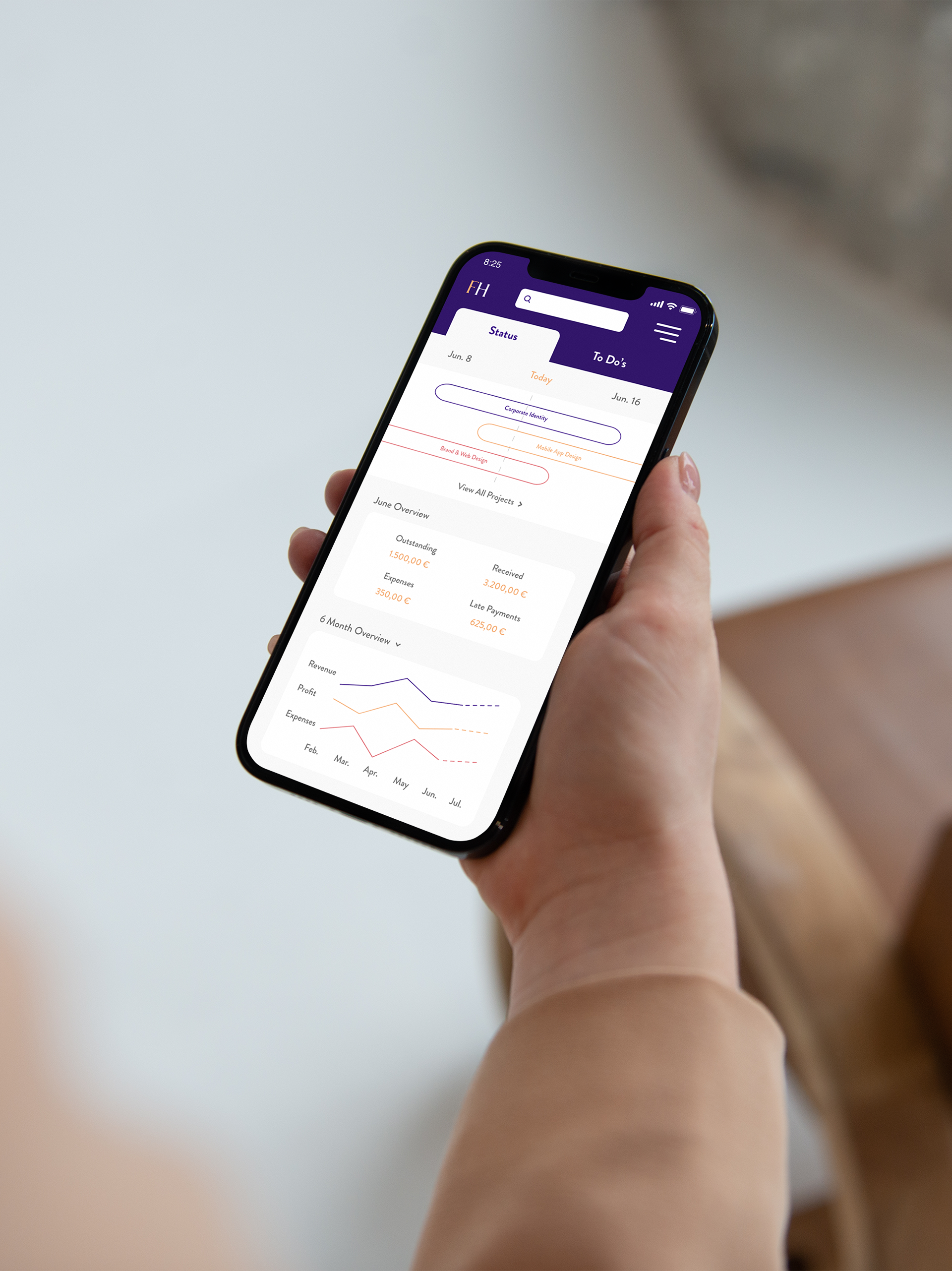
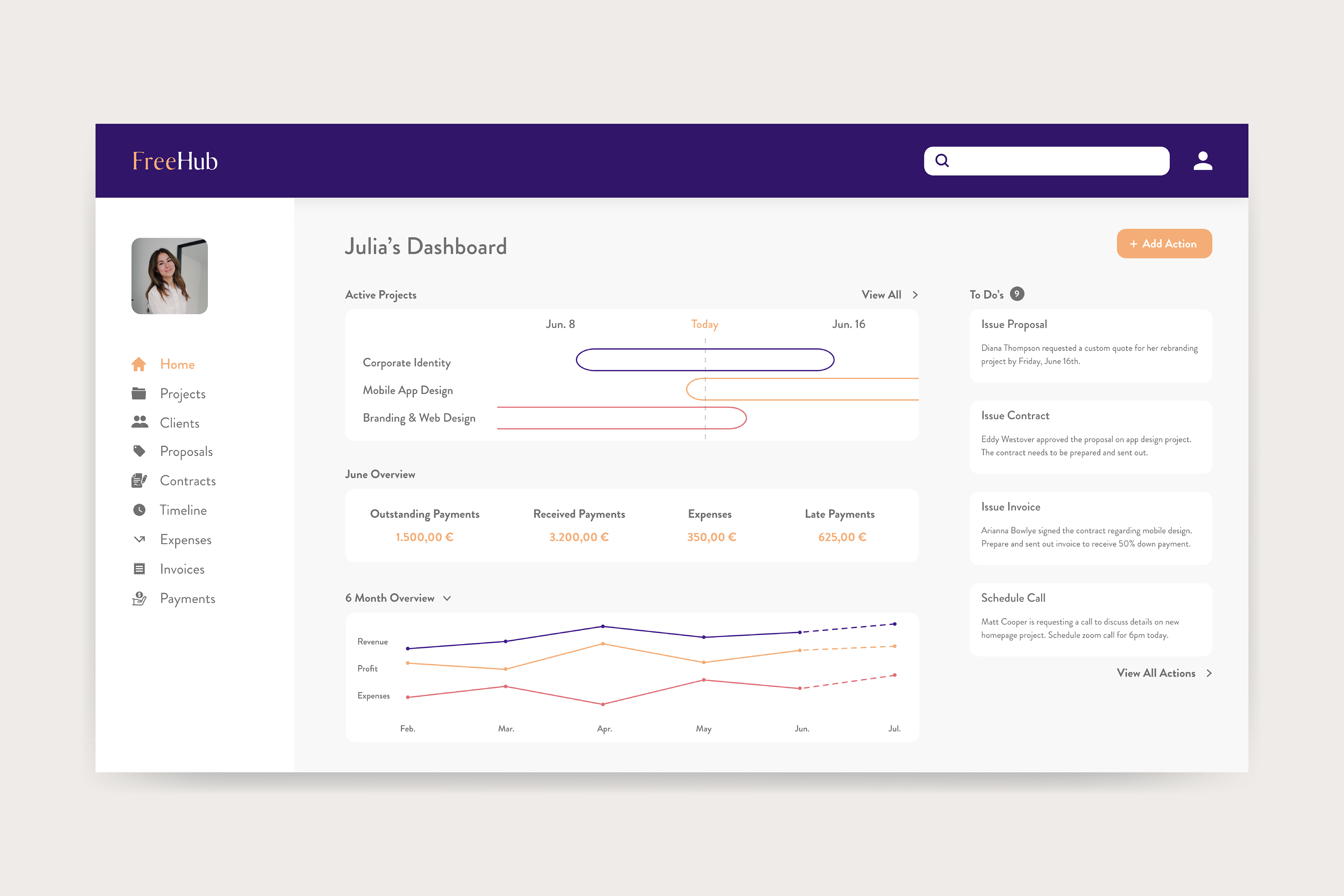
The main need addressed with this product - dashboard - is to enable freelancers to fully be in control of their business. This can be achieved by providing the user with relevant information - overview of business performance - and quick access to the app's navigation bar and actions. Pertaining to the informational goal, these needs can be fulfilled by providing the user with the financial and project's status alongside suggested action items.
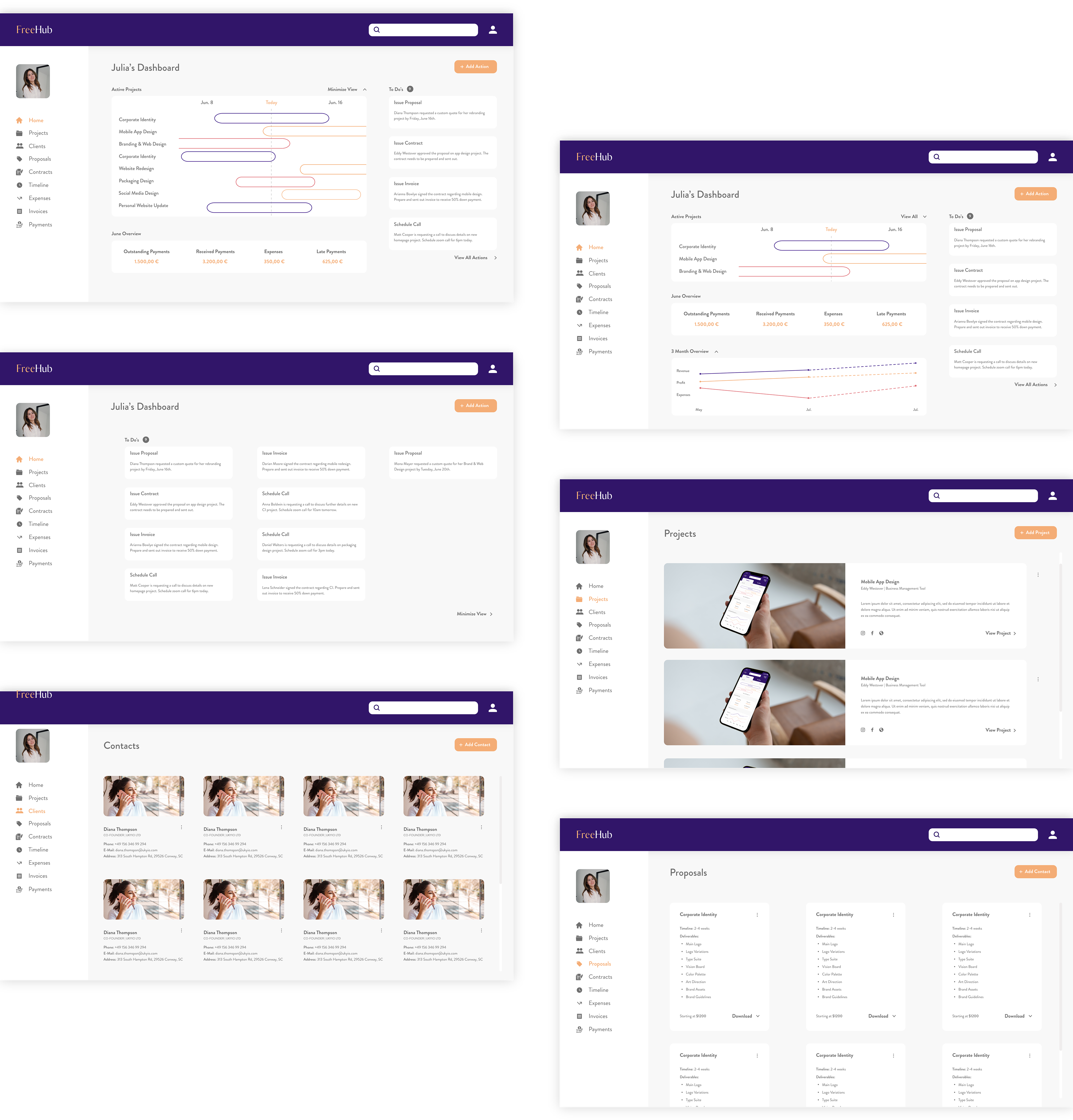
Wireframes
At the beginning of my design process I created fairly simple wireframes - desktop and phone - to visualize my idea.
Desktop: Sidebar Navigation
Let's start with the navigation. As everything in a freelancer's workflow is related to both a client and project, I defined these two as the main blocks allowing the user a quick access to clients and projects. The overall goal of a freelancer is to complete a project in order to get paid. To get there, freelancers normally walk through a specific process from issuing a proposal to finally receiving the payment. Deliberately placed in order, I have turned each step into a tool than can be accessed through the primary navigation at any point.
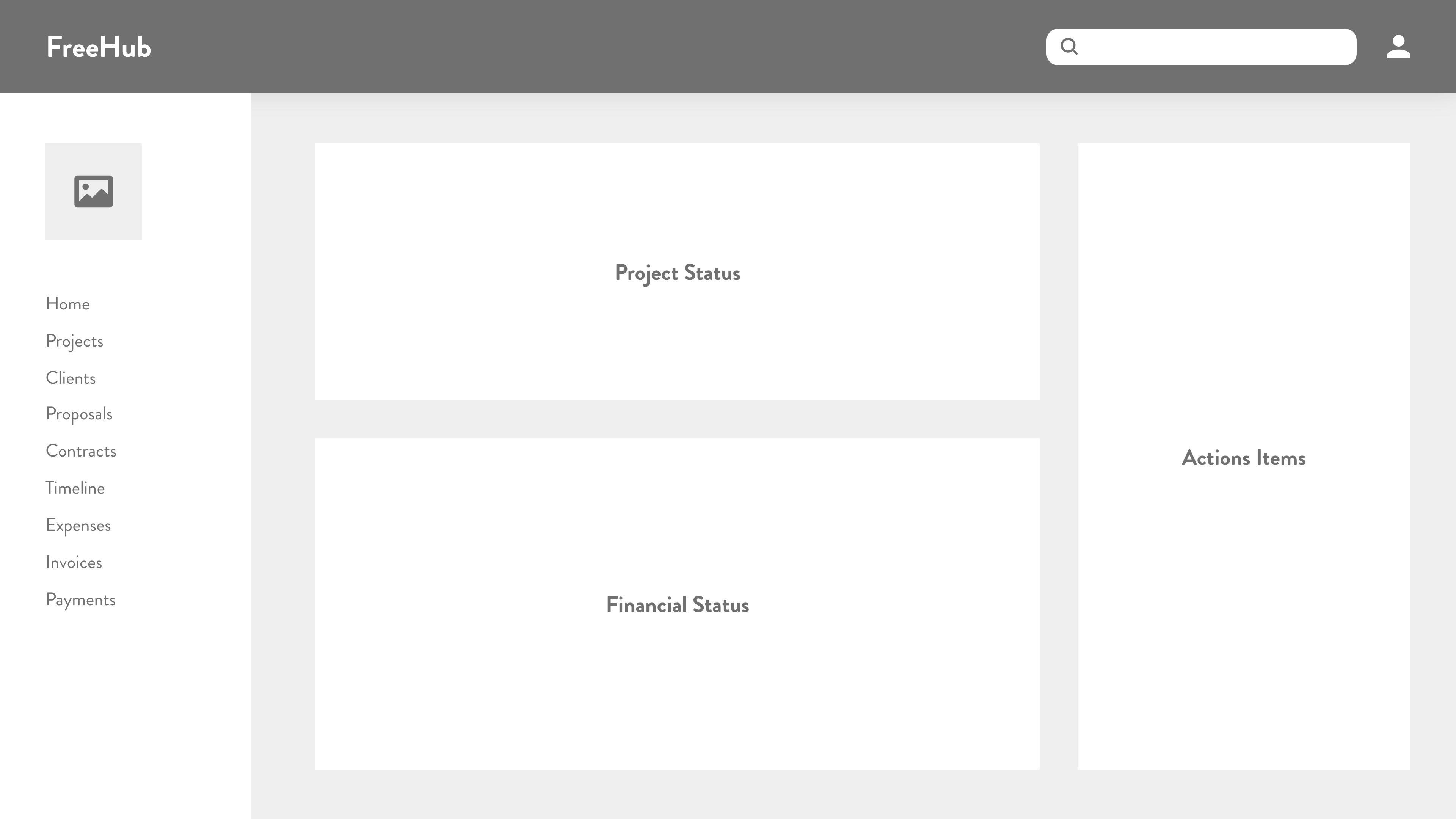
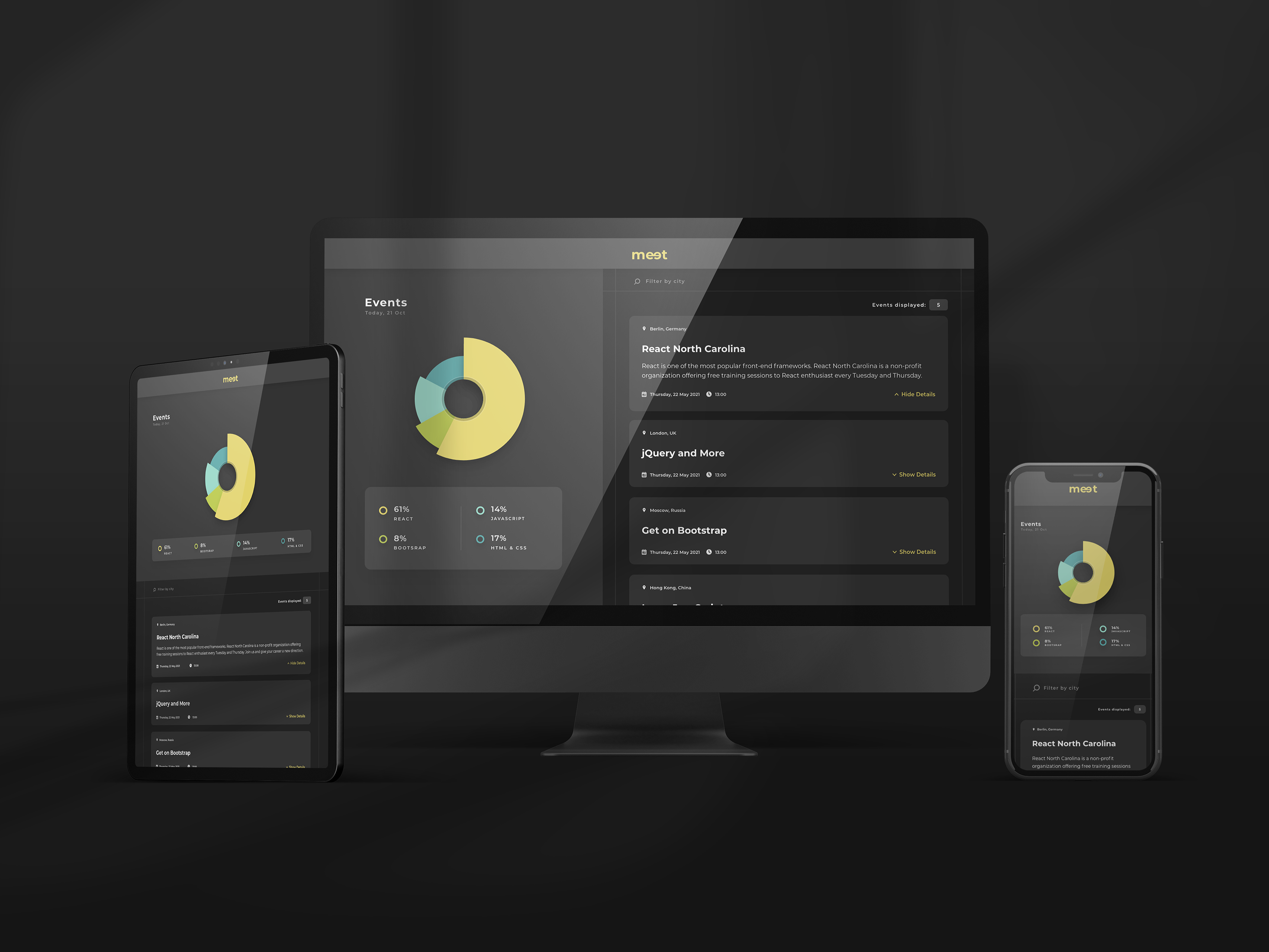
Desktop: Dashboard Content Areas
Conforming to the prioritized needs, I built the dashboard to have three content areas. I gave the project status area the highest priority, followed by the financial status. Since action items could be empty at various points, I considered them the least prominent area. The next hurdle was to understand what content each section should include.
The financial status should display all finance for the current month - outstanding payments, payments received,
overdue payments and expenses. Additionally, I believed a graph could be utilized as an overall tracking tool to
see the business's development regarding income, expenses and profit.
overdue payments and expenses. Additionally, I believed a graph could be utilized as an overall tracking tool to
see the business's development regarding income, expenses and profit.
The project cycle is following a chronological order. Hence, each project could be placed on a timeline providing an overview of the individual project's status.
Action items are optional. However, could be used to suggest next steps, such as follow up with a potential client that hasn't signed the contract yet, that moves the project forward. I also believed this content area could be optimized by adding a CTA (call-to-action) button - "Add action". Through performing a click interaction with this button, the user has the option to add as many new actions as necessary.
Furthermore, I added two more features I saw fit: the "Profile" and "Search". These should be accessible and visible at any time. Thus, I placed them in the fix header.
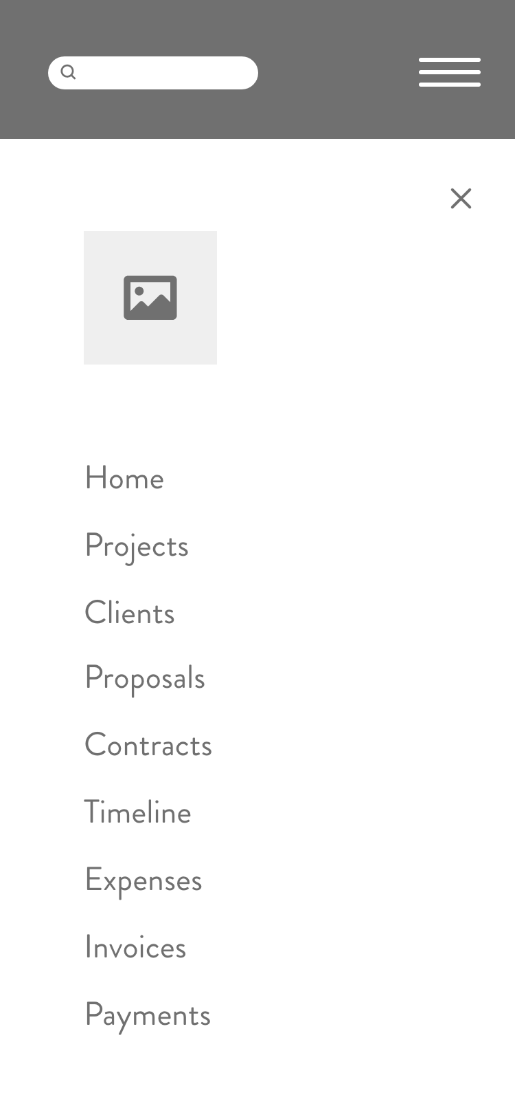
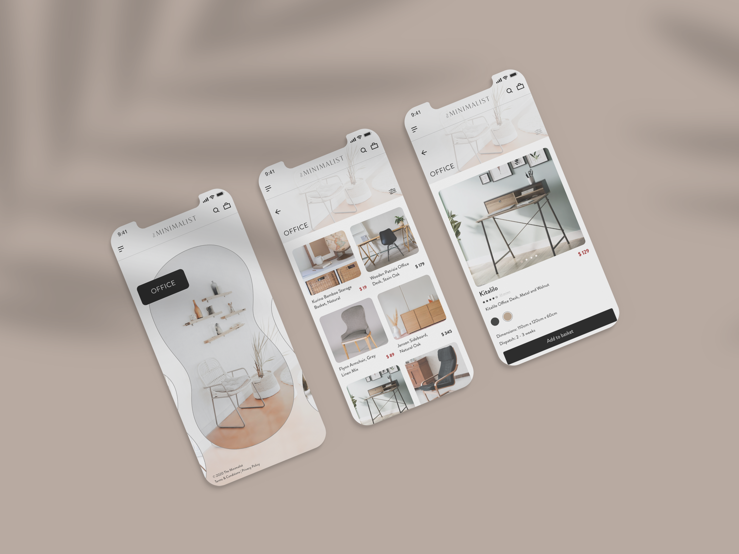
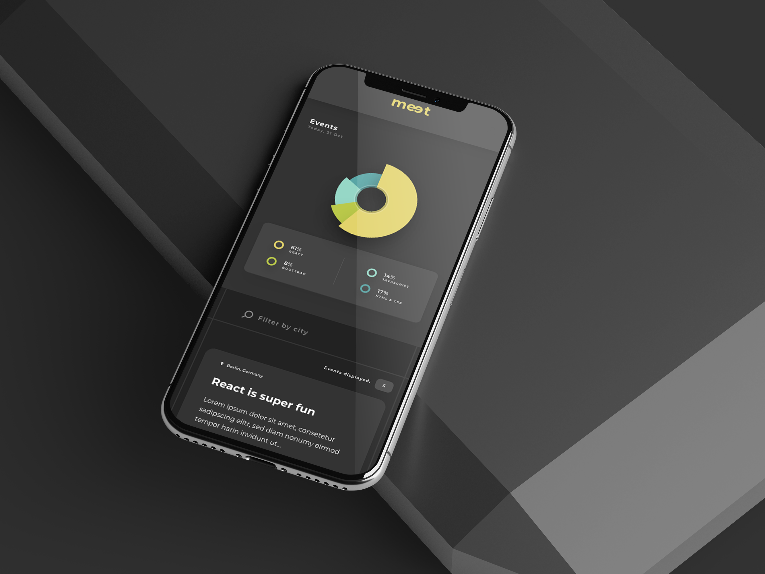
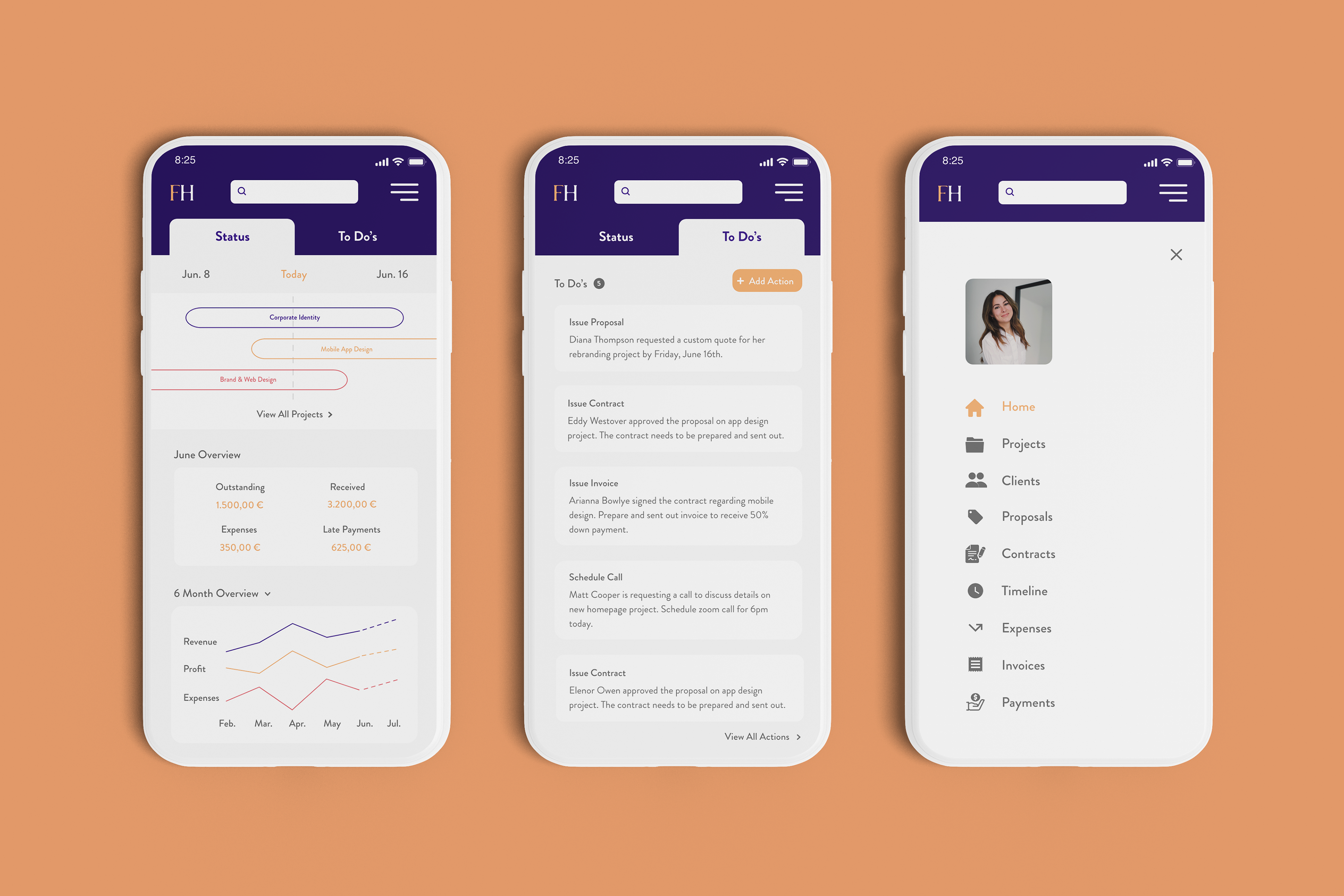
Mobile: Hamburger Menu
Moving on to the mobile version, I had to reorganize the content by minimizing the navigation to a so called hamburger menu. Even though this type of menu can hinder navigation discoverability, it simultaneously allows to get everything tucked away neatly.
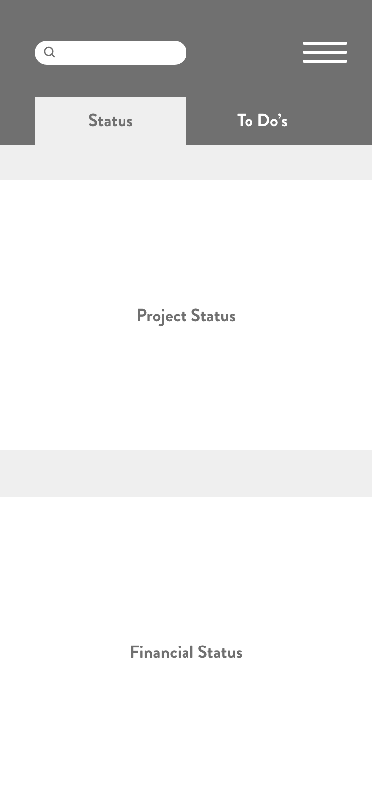
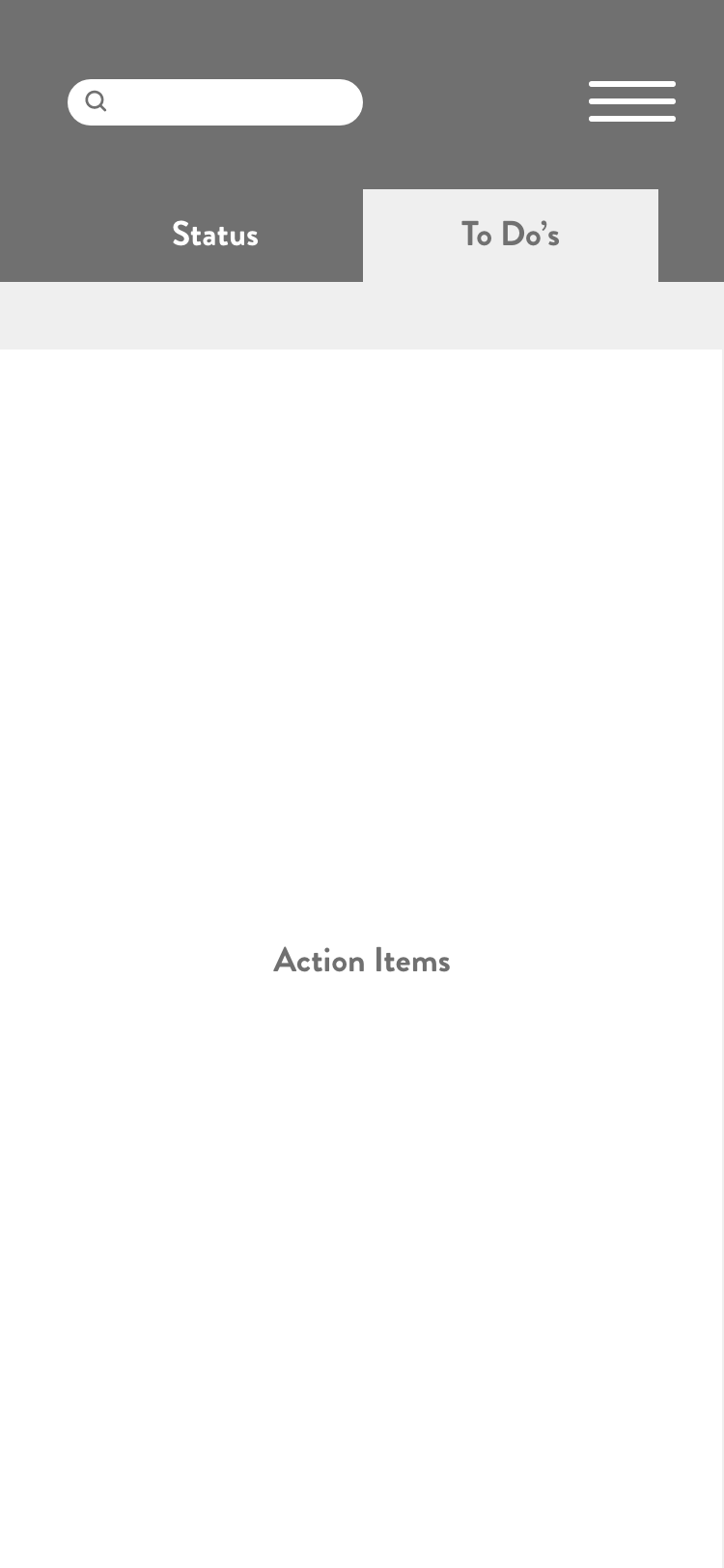
Mobile: Dashboard Content Setup
Mobile: Dashboard Content Setup
Since we are dealing with a lot smaller space in the mobile app, I created a separate tab for the "To Do's". On the main tab I displayed the prioritized content areas - project status and financial overview. This way we can provide the user with any important updates on their business with a glance.
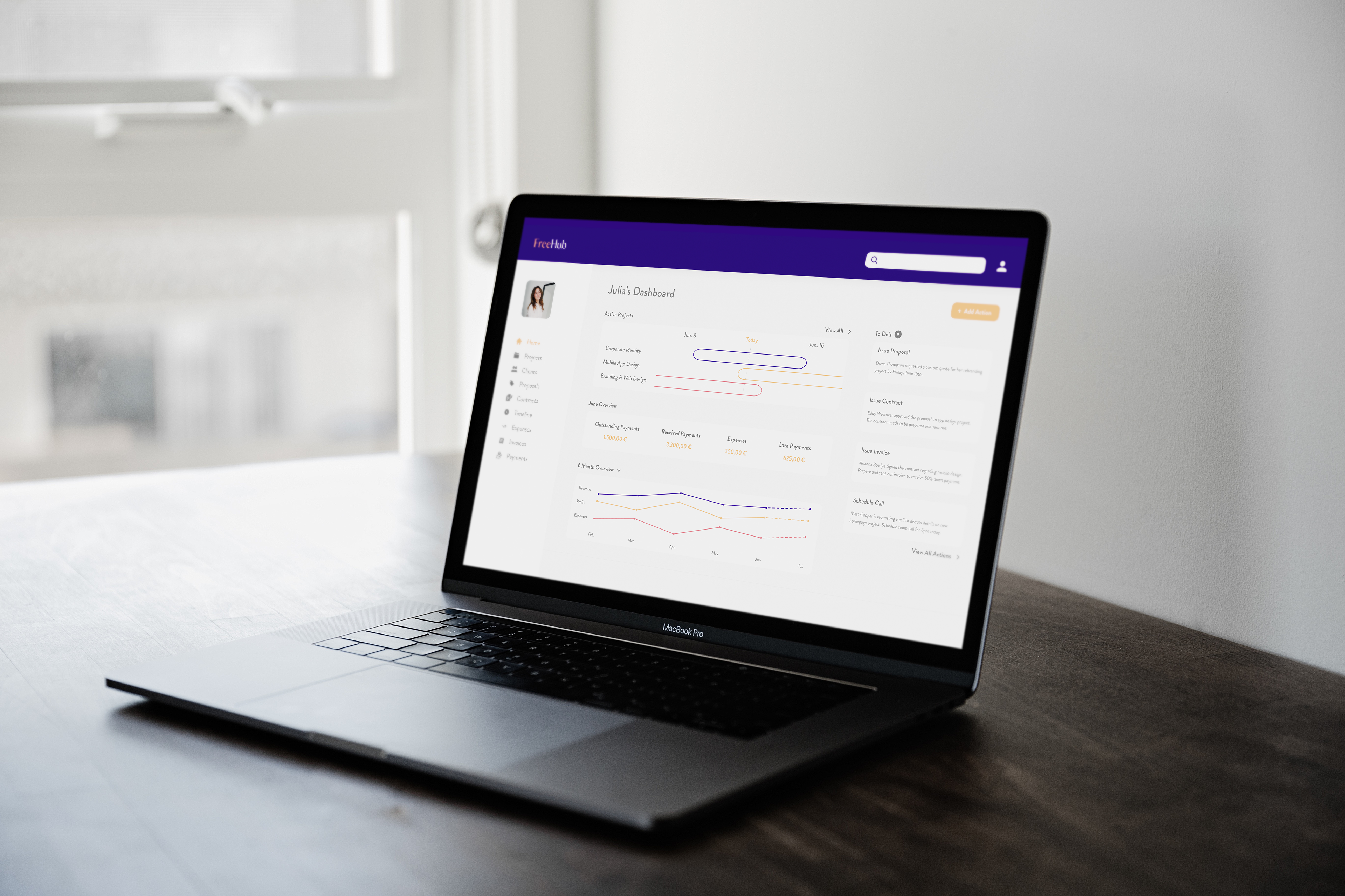
UI Design
After validating the main concept, I started designing the final screens for both the phone and desktop app in Adobe XD. I improved the prototypes over multiple iterations.
That's what happened next
Inspired by minimalism and an open concept, I went for a light and clean design. Using Material Design as the system of components and guidelines, I started creating the desktop screens first. Based on the information I pulled from my interviews with other freelancers, I then started to implement the various screens. For that, I followed the iOS Styleguide.
I'm especially proud of the graph and active project tracker. Providing transparency to our users by showing them their financials and projects' status not only makes their life easier but also instills a substantial amount of trust in this product.
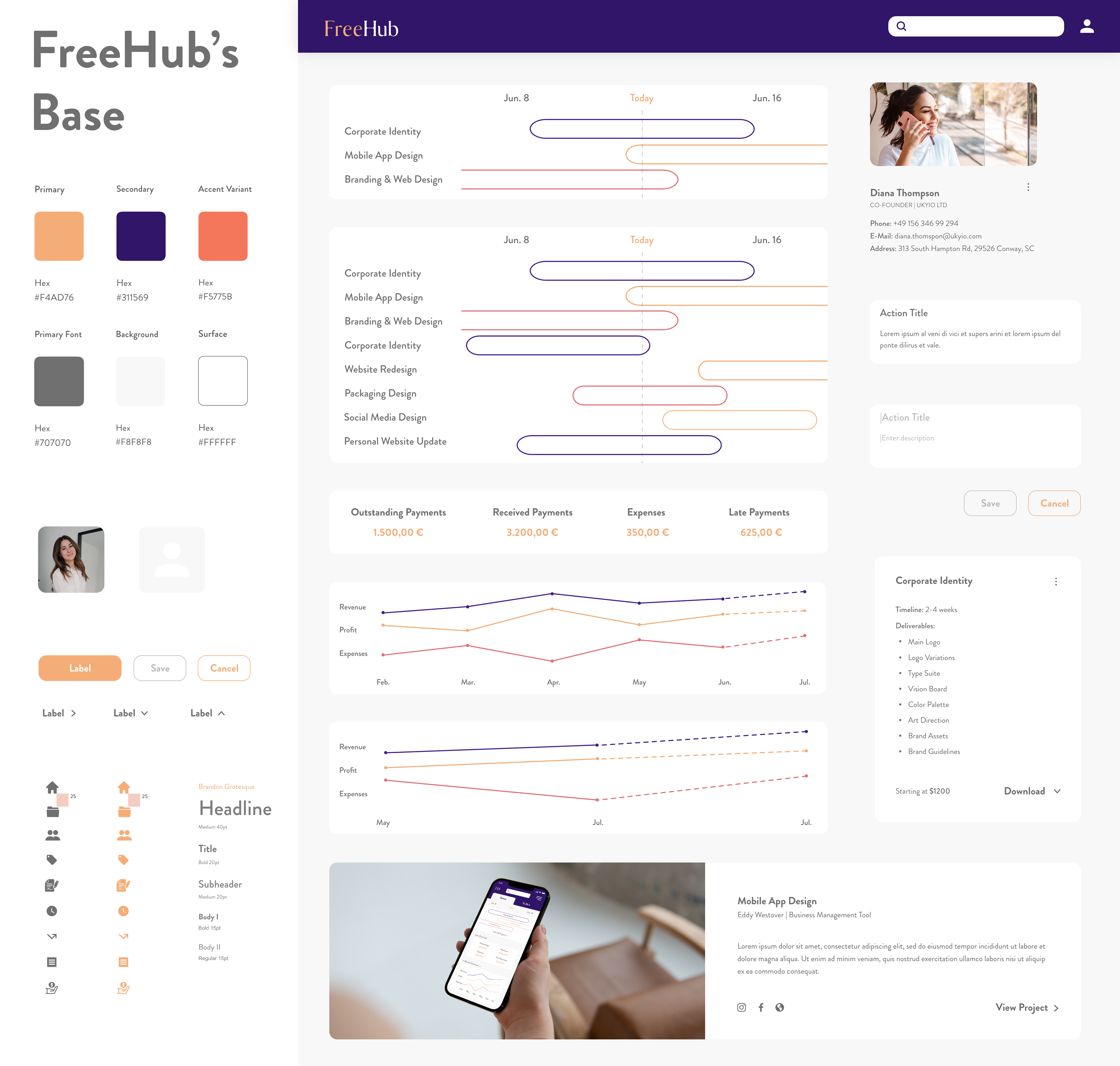
Practicing Atomic Design
Following the atomic design system, I broke down my web application into its basic components, so I could reuse them as needed throughout the project. Personally, I am a big fan of atomic design since it not only works well for us designers but also brings us closer to the developers' approach that they use in their work. Thanks to this, collaboration across teams is so much more effective and efficient.
Showing results is much more effective than sharing plans.
Ways To Measure The Products Success
In order to determine whether or not this product provided a transparent way to quickly move forward in a project, the completion rate of action items could be calculated. I would also suggest to run a survey on the dashboard both before and after the product launch. Customers will be asked to respond to certain statements on a scale from strongly agree to strongly disagree.
Substantially, the home dashboard will affect the key metrics of the product as a whole. Thus, the three key performance indicators - project, financial status and action items - would provide useful measurement tools to determine the success. To be mentioned, here are a few product metrics I thought of:
- Earning increase percentage
- NPS (Net Promoter Score)
- Project completion rate
I would also advice to conduct usability testing to test vital functions and, if necessary, to optimize the app where it needs to be. So far, I conducted those user tests through Useberry which I found quite handy. The onboarding of participants is quick and simple and the results are promising regarding quantitative and qualitative feedback.
Project Learnings
Designing the FreeHub dashboard thus far has been such a positive learning experience. Starting from the user research to high-fidelity prototypes taught me a lot about the user-centered design process. My utmost crucial learning whilst conducting was that simplicity is key. Lured by attraction and trends, we-as designers- want our designs to be out of the box. However, keeping the "why" in mind is what truly matters. The primary goal of a designer is to fully understand the users and the problems they are facing. Only then, we can come up with a design that solves these issues.