Overview
Self-studying can be isolating. There is often little to no interaction between other students and mentors and so it can be very difficult to stay disciplined and motivated. This is where Meet comes in. As a fully progressive web application, Meet creates an inviting and collaborative space for learning enthusiasts. Users can quickly and effortlessly search for available events of their interest and sign up for them. Regardless of the user's location, an integrated filter function enables the user to find nearby events in a matter of seconds. Meet intends to connect people and enhance the overall learning experience.
Duration: 2 weeks
Tools: XD, Photoshop & After Effects
Deliverables: User Interface Design, Visual Design & Promo Video
Enabling peer-to-peer learning.
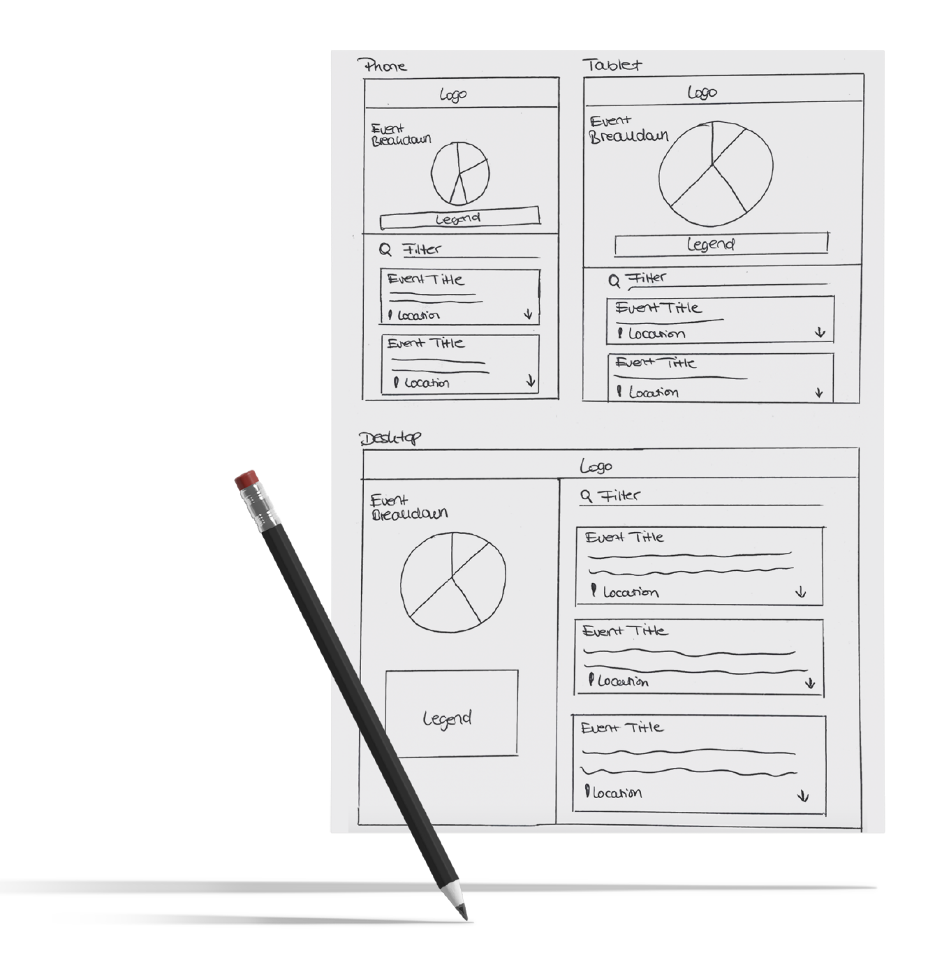
Initial Sketches
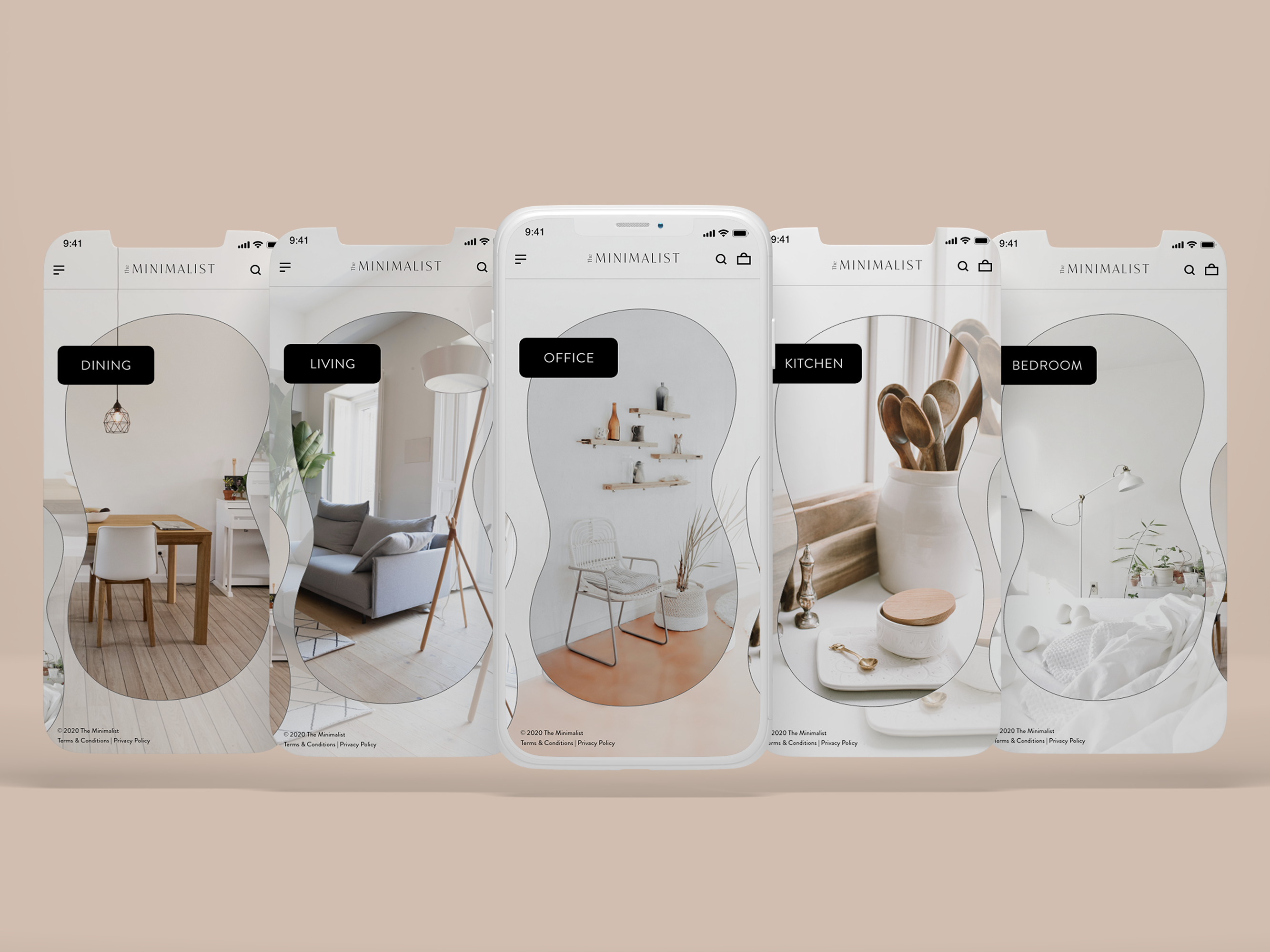
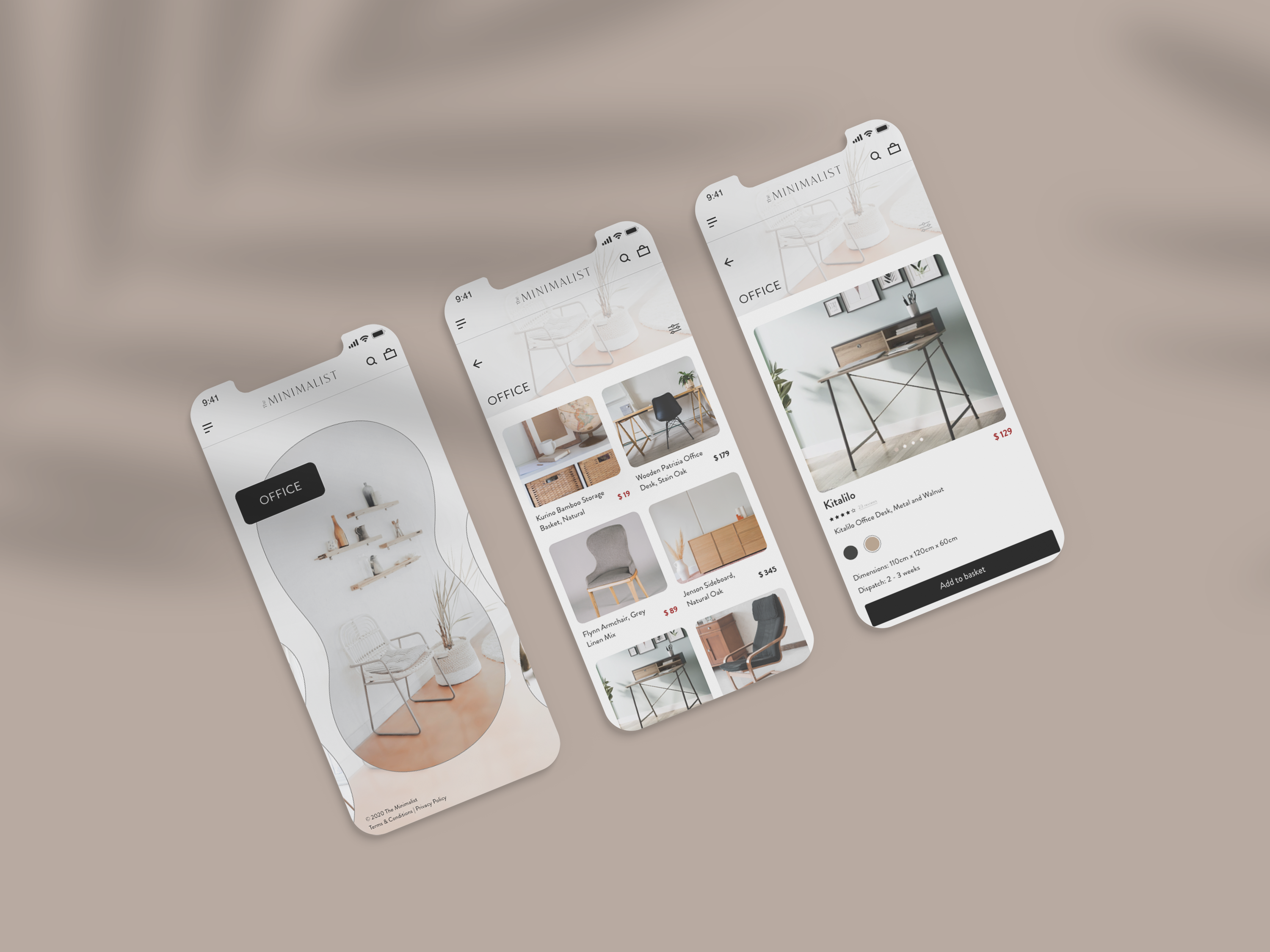
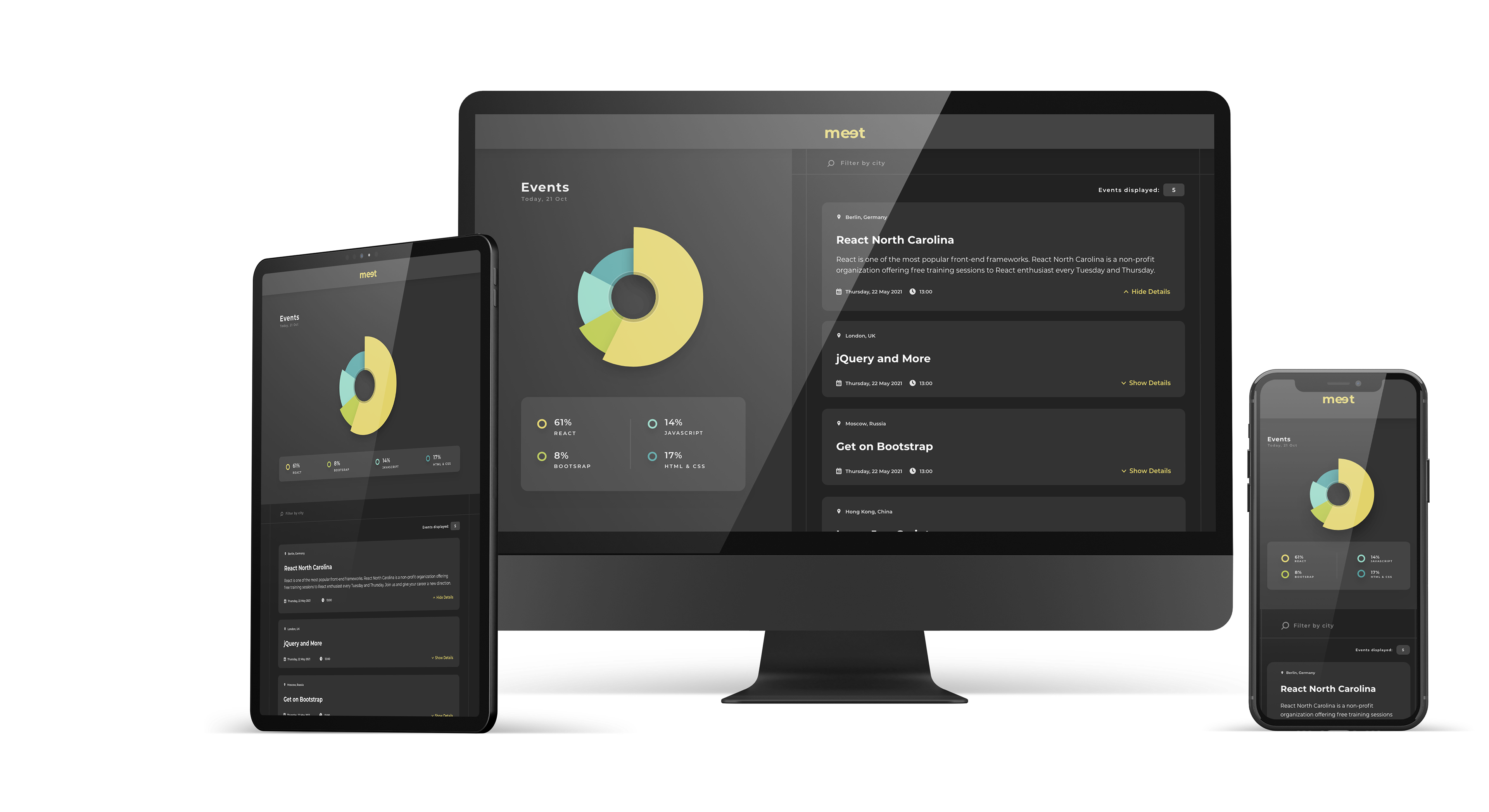
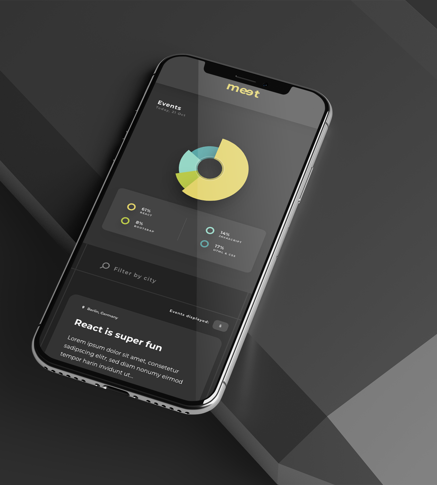
This project was posed to me as an event discovery web app that needed the UI fleshed out. After obtaining some basic information about the target audience, I defined user stories for why they would be using this application. I instantly felt connected to this brief as I spent a lot of time studying on my own, thus, allowing me to relate to the end-users even better. The key challenge was how to make learning more collaborative and less isolating in today's world. Taking my learnings and insights into account, I created the first initial sketches for phone, tablet and desktop. In the following stage, I refined my designs using existing design patterns from LinkedIn and Google Material Design. I optimized the UI elements in a way to ensure that they worked cohesively for the end-users. Relevant features users were looking for was a filter by city function alongside an event overview.
This project was posed to me as an event discovery web app that needed the UI fleshed out. After obtaining some basic information about the target audience, I defined user stories for why they would be using this application. I instantly felt connected to this brief as I spent a lot of time studying on my own, thus, allowing me to relate to the end-users even better. The key challenge was how to make learning more collaborative and less isolating in today's world. Taking my learnings and insights into account, I created the first initial sketches for phone, tablet and desktop. In the following stage, I refined my designs using existing design patterns from LinkedIn and Google Material Design. I optimized the UI elements in a way to ensure that they worked cohesively for the end-users. Relevant features users were looking for was a filter by city function alongside an event overview.
Visual Design
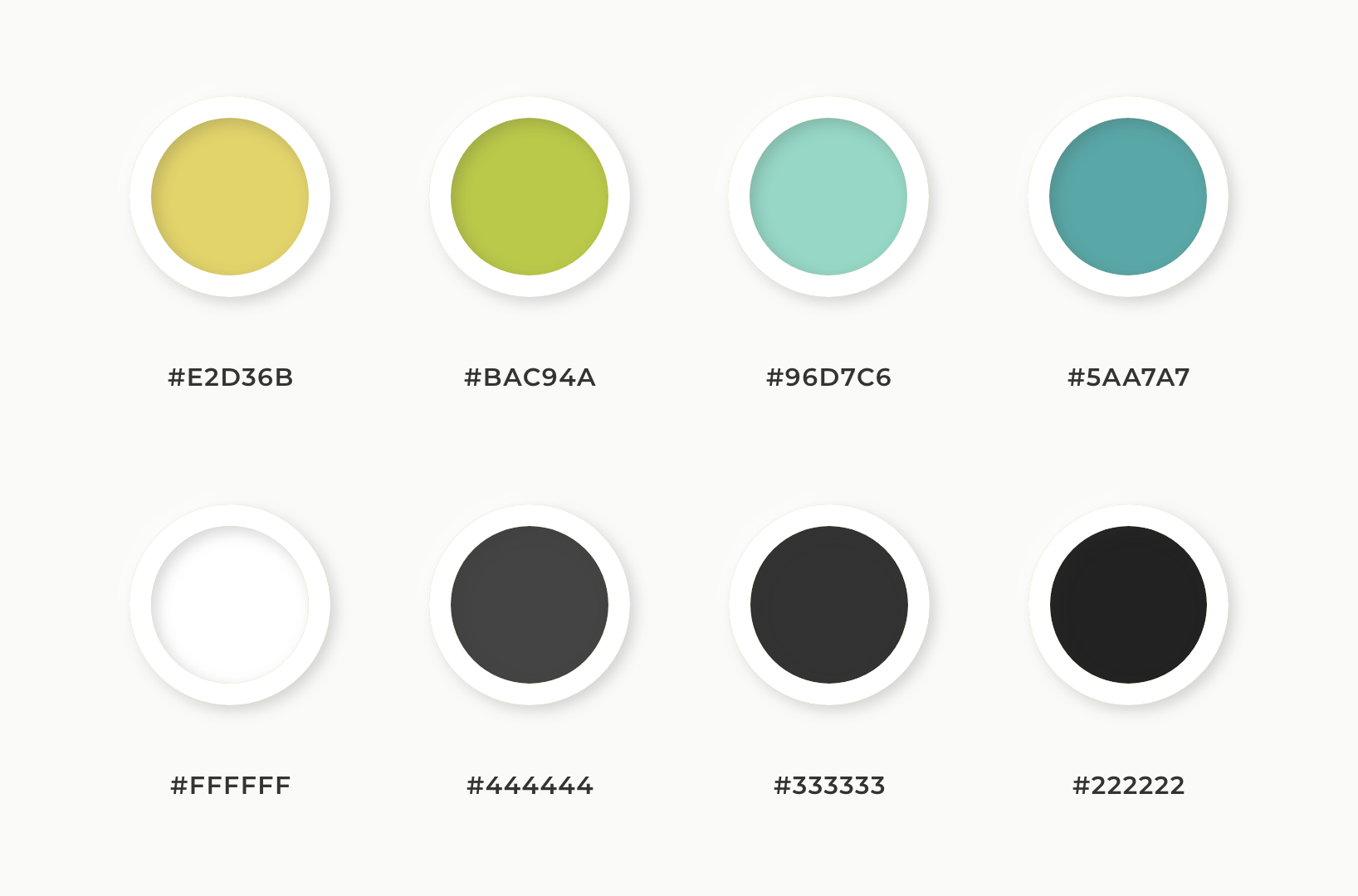
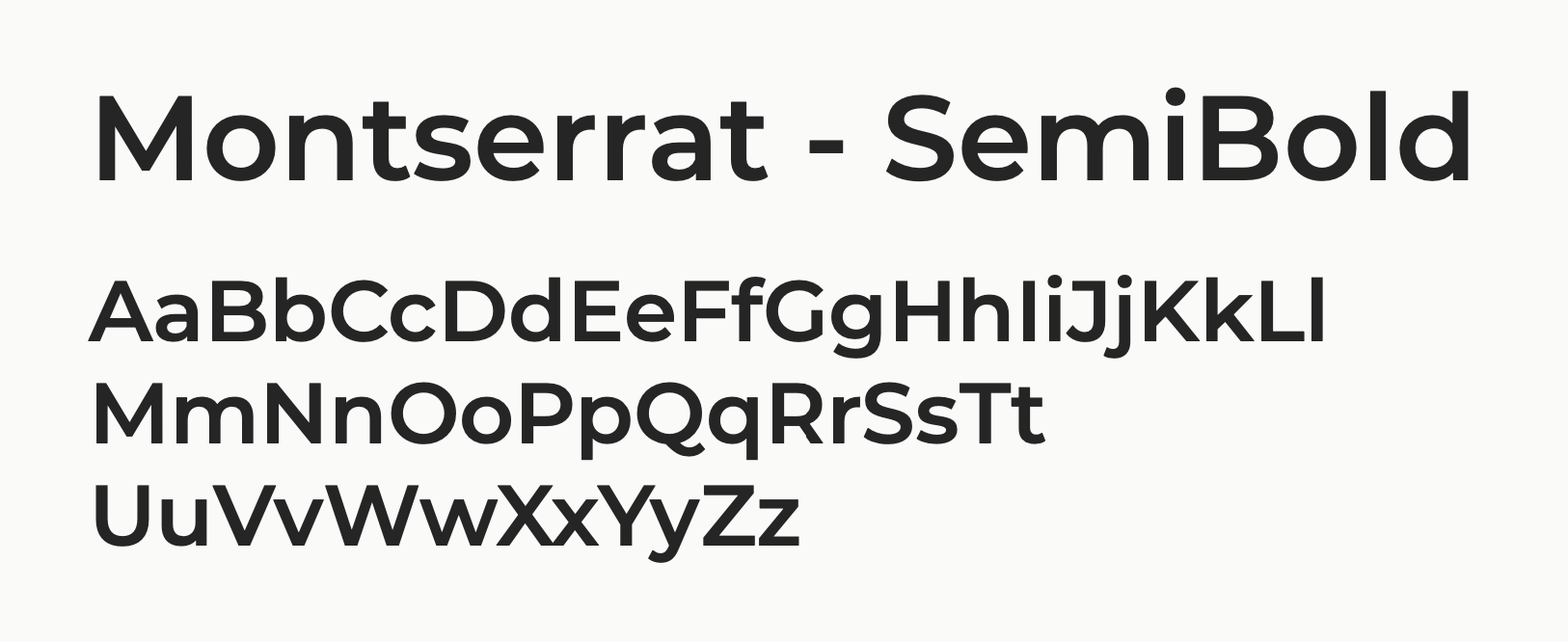
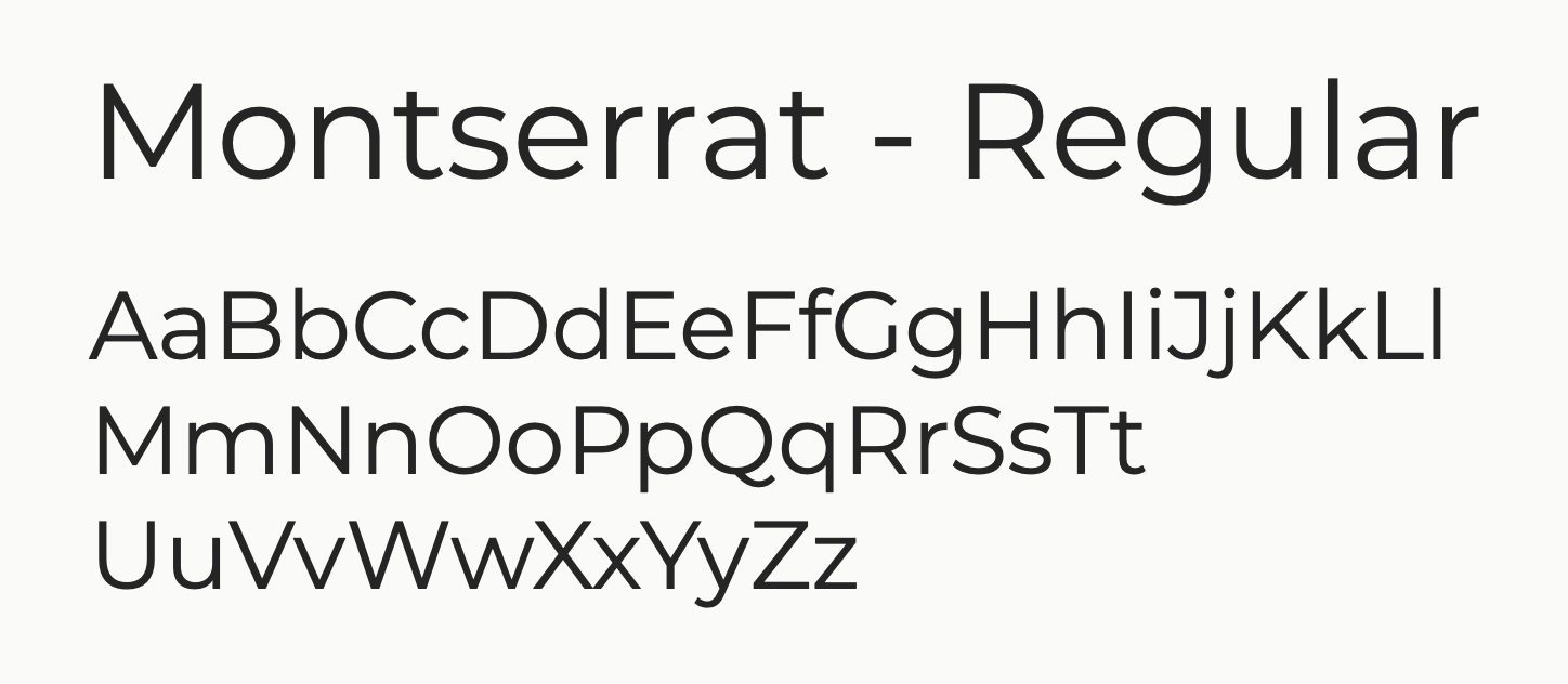
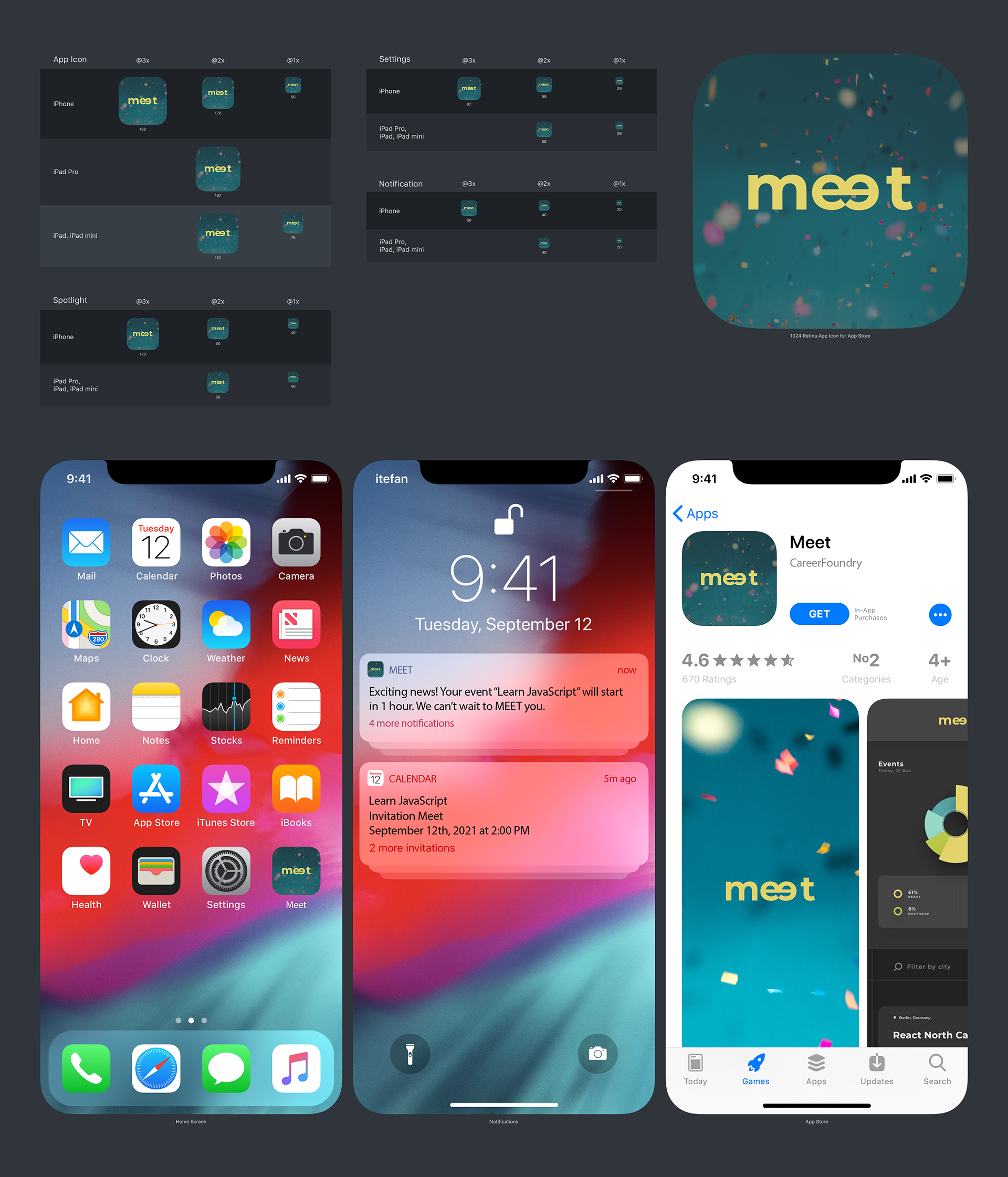
After some inspirational research, the next step was creating a mood board. Hereby, I collated various visual elements that would perfectly make up the look and feel of Meet. From there, I put together the color palette for the User Interface and designed the logo. Montserrat was chosen as the main typeface used within the Meet logo itself and throughout the web app design. The logo appears to be very minimal. Yet, the two facing letters "e" symbolize the aspect of face-to-face, peer-to-peer learning respectively.
After some inspirational research, the next step was creating a mood board. Hereby, I collated various visual elements that would perfectly make up the look and feel of Meet. From there, I put together the color palette for the User Interface and designed the logo. Montserrat was chosen as the main typeface used within the Meet logo itself and throughout the web app design. The logo appears to be very minimal. Yet, the two facing letters "e" symbolize the aspect of face-to-face, peer-to-peer learning respectively.
Nobody can look away from a good story.
Project Learnings
For this project, I collaborated with full-stack developer Marquez Moore following an agile working approach. To ensure a functional, easily accessible and dynamic end-product, I applied XD's 12 column grid system. This way, I was able to create a consistent design across multiple devices. Even though, I only had two weeks to create a rough concept, high-fidelity wireframes and the promo video, it all worked out well. Overall, I am proud of the direction it has taken from the user stories to its atomically designed screens. Some future improvements I would implement, would be to allow the users to actually sync events they have signed up for with their Google calendar and to integrate a smart search function for more discoverability.