The Project
Yomela which stands for Yoga, Meditation, Lebensfreude & Achtsamkeit is a warm-hearted, empowering and female-led online business founded and run by Ariadne and Marie. It was born out of their deep desire to help people experience the positive impact of personal growth in life. As a digital marketplace for personal development and happiness, Yomela aims at connecting consumers and qualified experts efficiently in order to make personal growth bigger in society.
In the role of the Brand Designer, I initially consulted my clients about a possible rebranding. Even though the company already had quite an impressive online presence on Pinterest with 12k followers and over 10 million monthly views, a rebranding would allow them to become a bold and inspiring market leader. By reviewing their brand heart, logo and color palette, I quickly discovered that their identity was lacking uniqueness and didn't align as much with their established brand values. Moving forward, I analyzed their market, defined and created a visual language as an extension of the brand such as colors, typography and illustrative elements. Throughout the process, I kept my clients involved to avoid any misunderstandings.
As the e-commerce business will dominantly operate online - through their website and socials - the goal of this project was to establish a clean and feminine-oriented corporate identity with a strong digital appearance.
Duration: 3 weeks
Tools: Illustrator, InDesign, Photoshop, Procreate
Deliverables: Visual Identity and Brand Guidelines
Target Audience
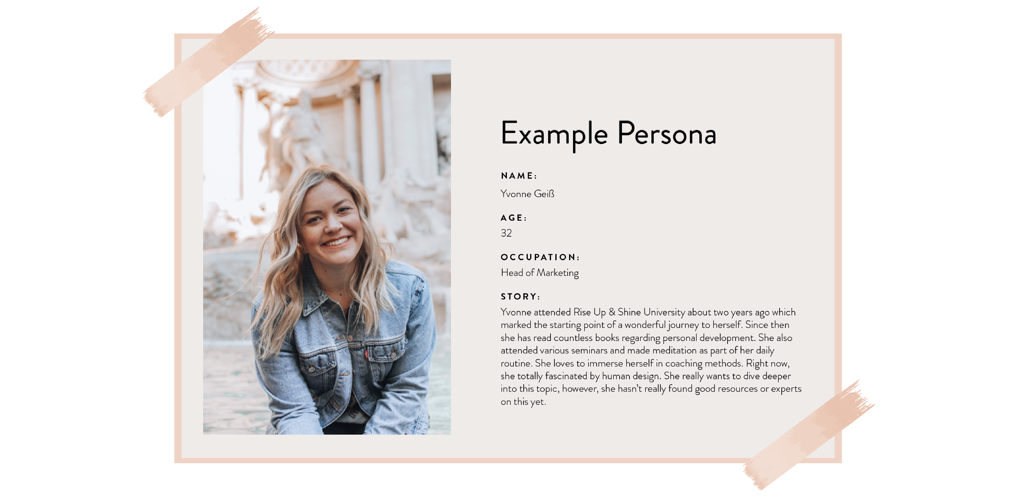
Yomela primarily targets a feminine audience. The cluster mainly includes women between the ages of 30 and 40 with a medium to high income. More precisely, Yomela aims at those that feel lost and lonely with the deep desire of growing personally and living a truly fulfilled and happy life.
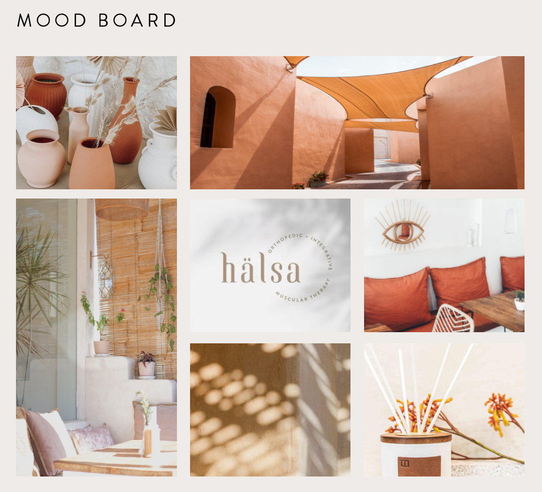
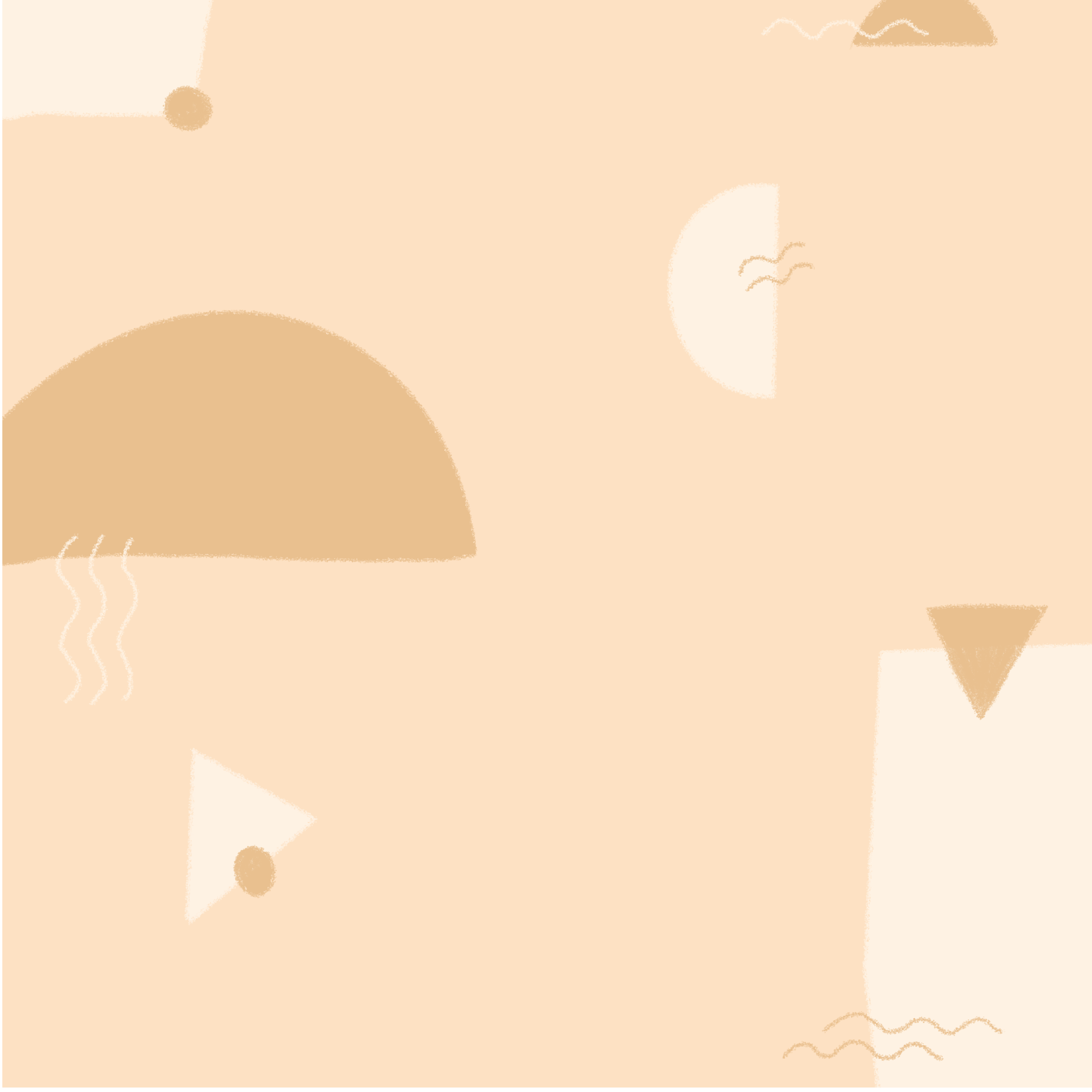
The concept plays on warm tones and can combine both serif and sans serif fonts to create a modern, yet minimal look. With a very feminine appearance, this concept perfectly represents Yomela and appeals to its desired target audience.
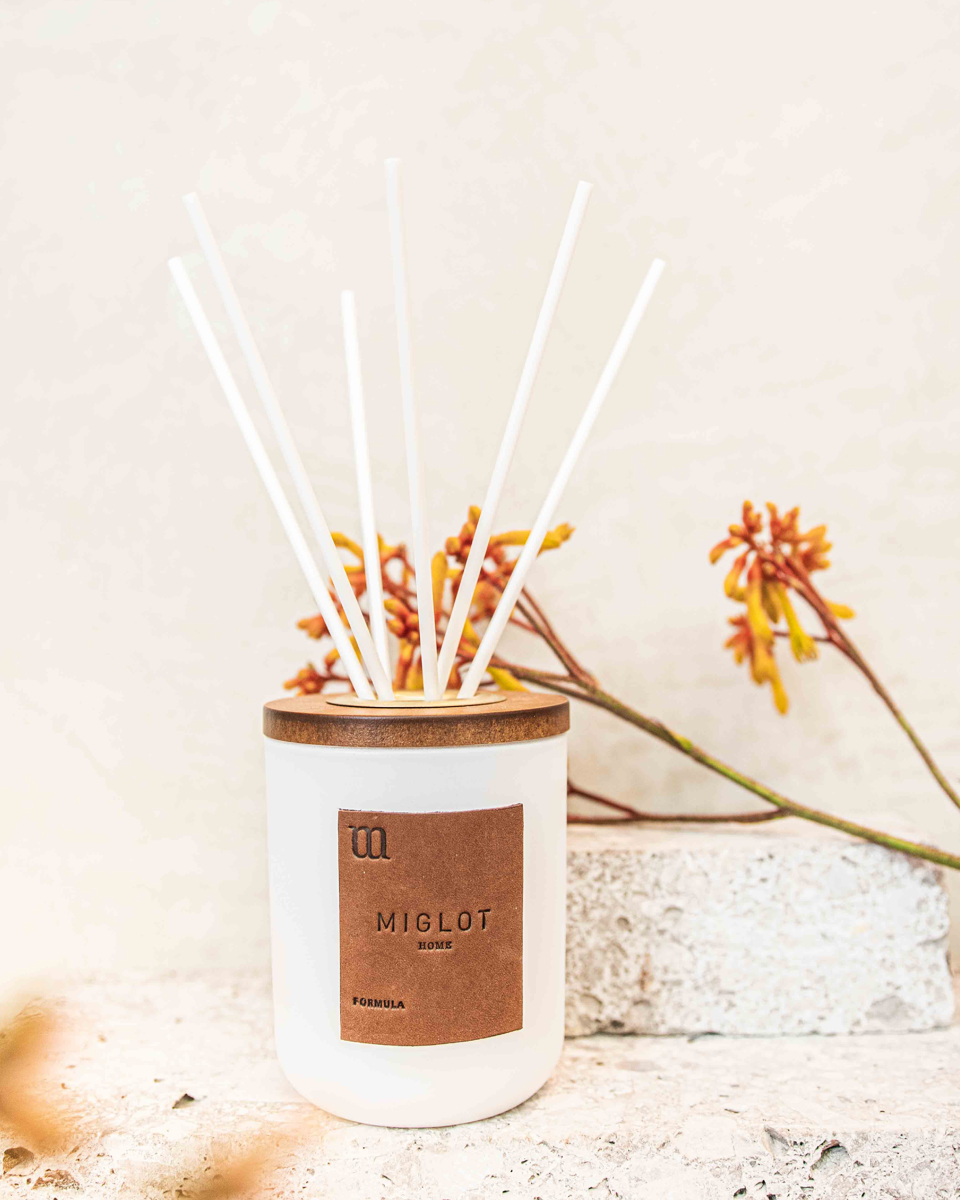
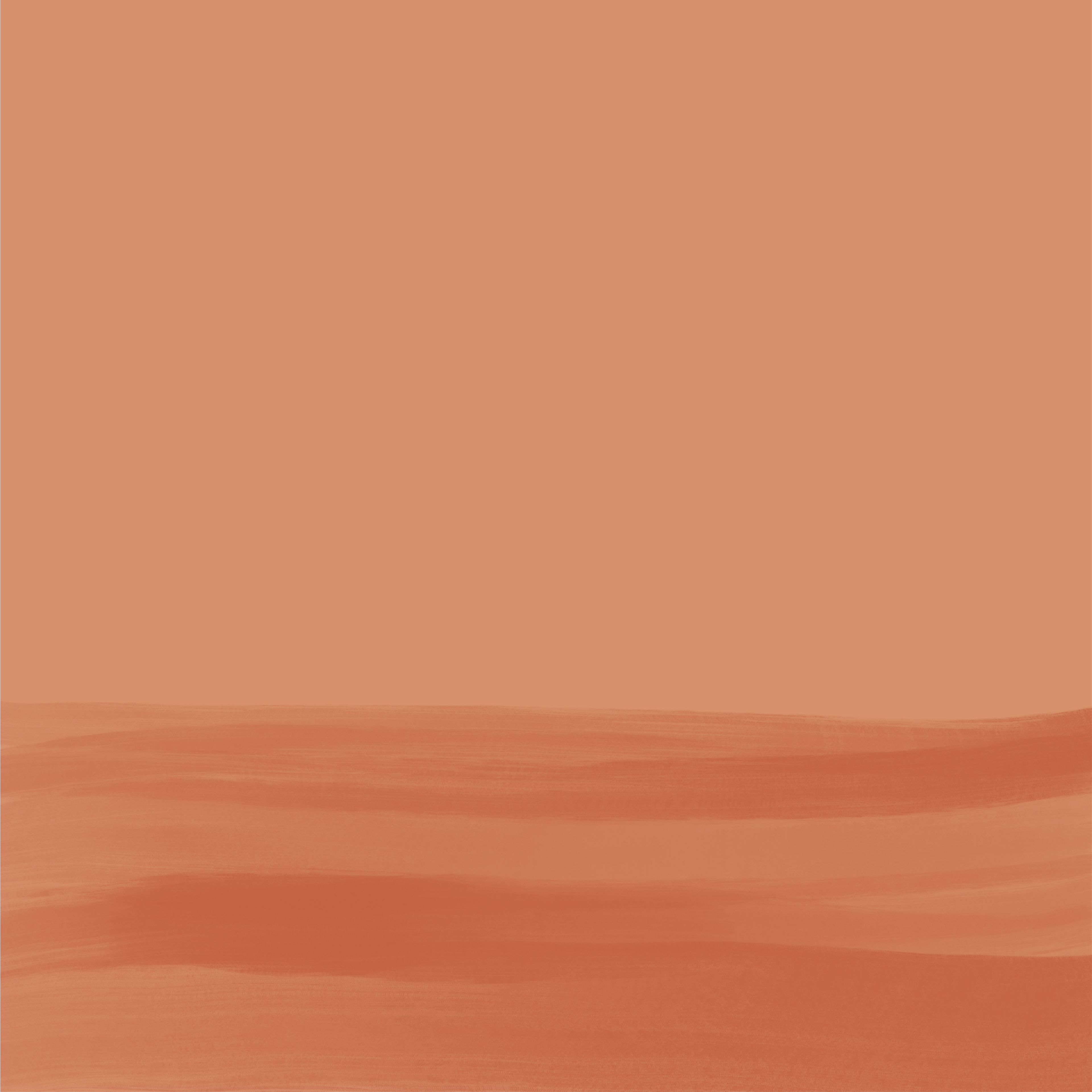
The colors follow an ochre - terracotta palette. Warm and friendly, they create a positive and empowering atmosphere complimenting Yomela’s tagline that life is beautiful.

Inspiring
Passionate
Welcoming
Empowering
Solution-driven
A great brand is a story that is
never completely told.
never completely told.

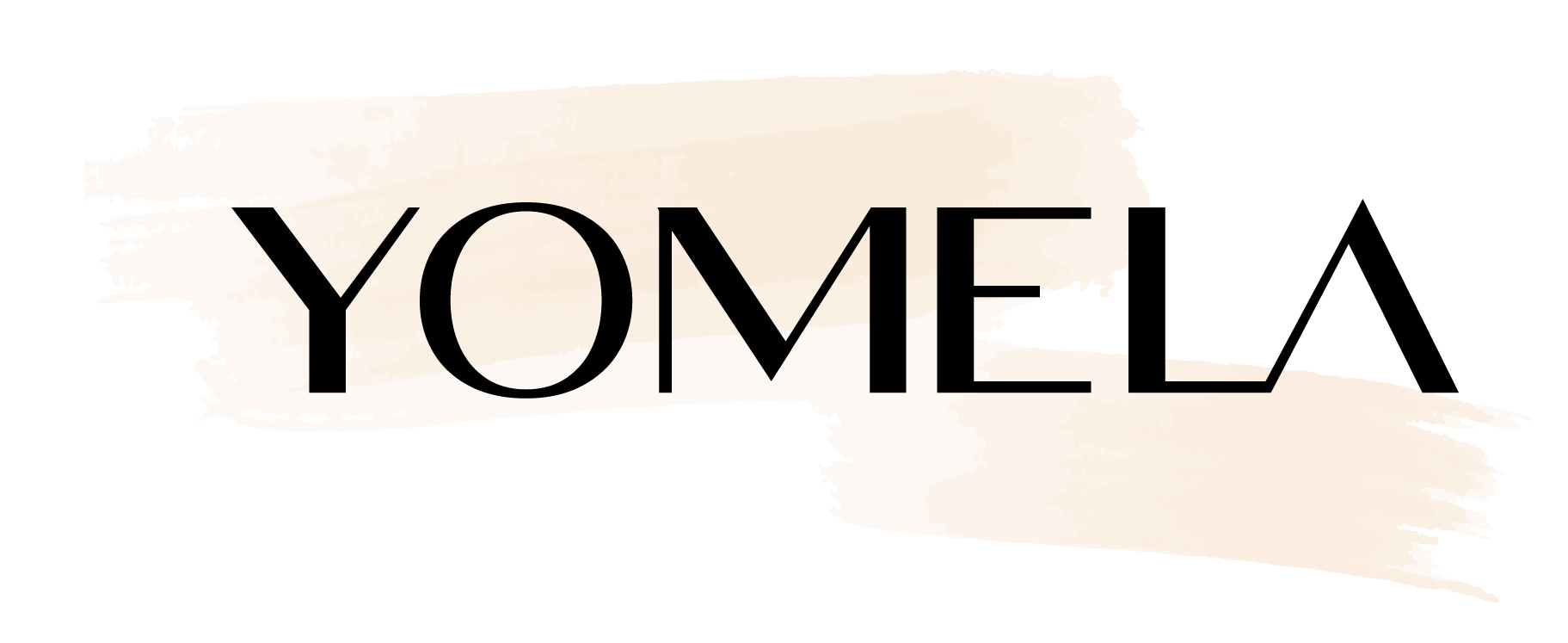
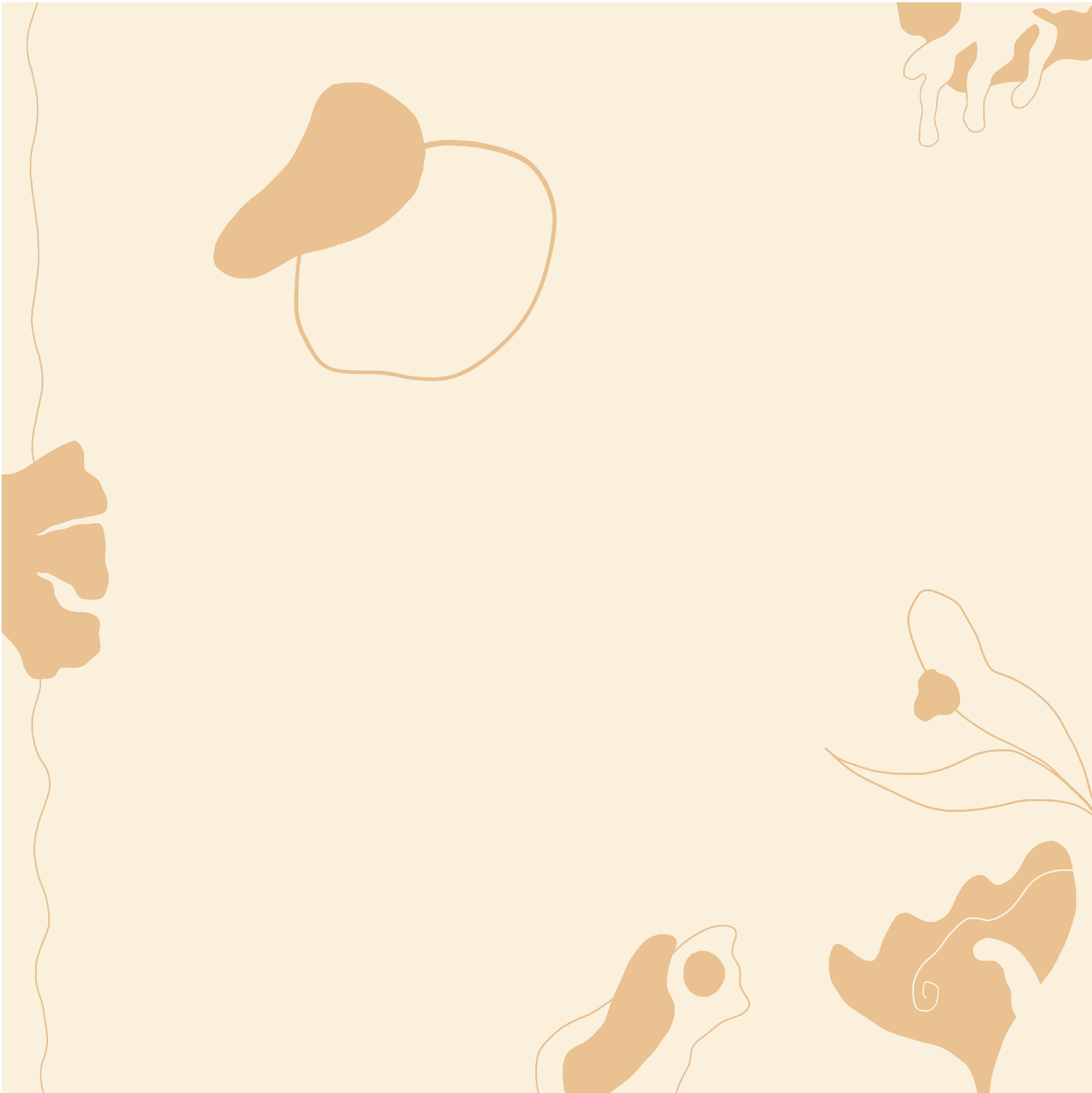
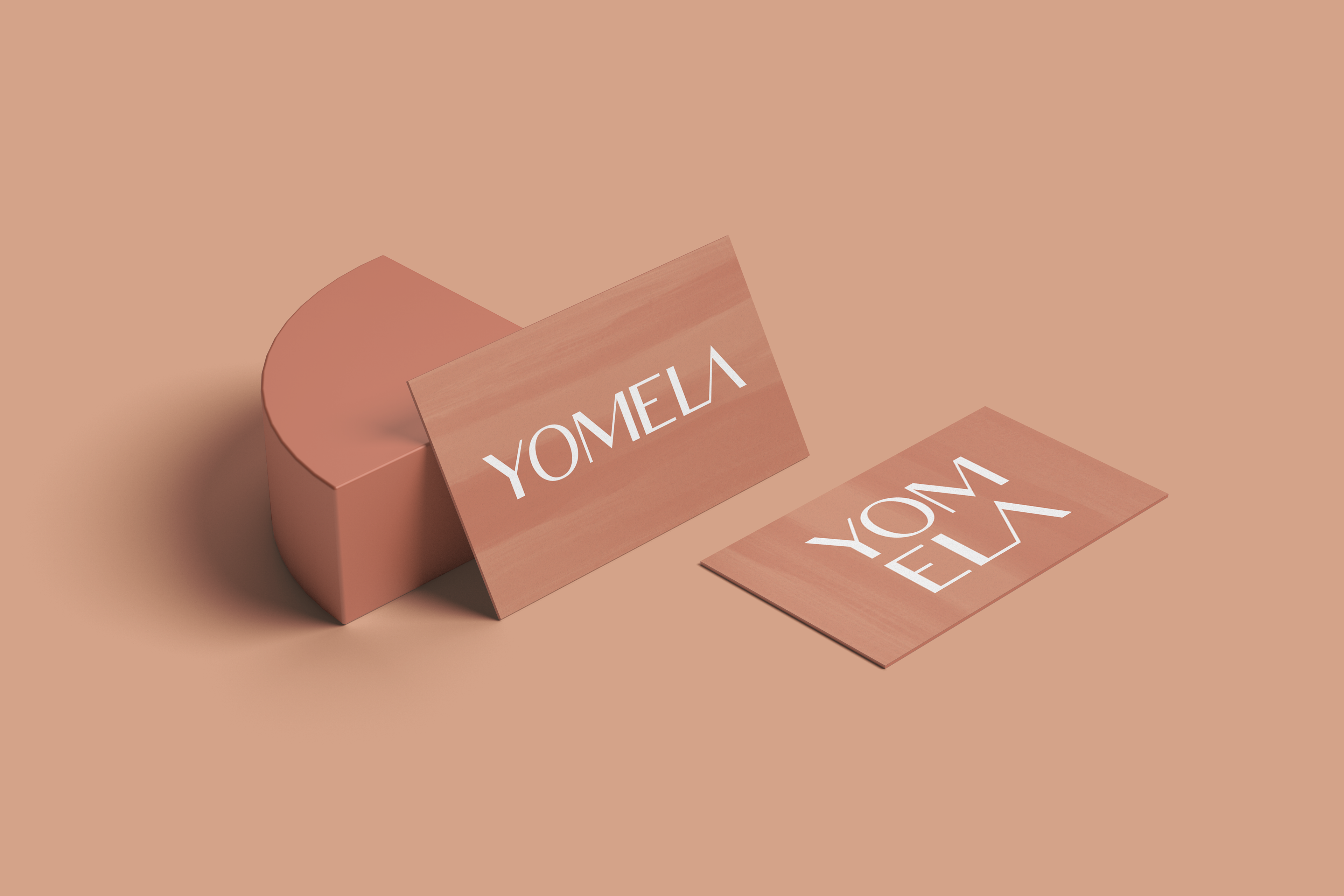
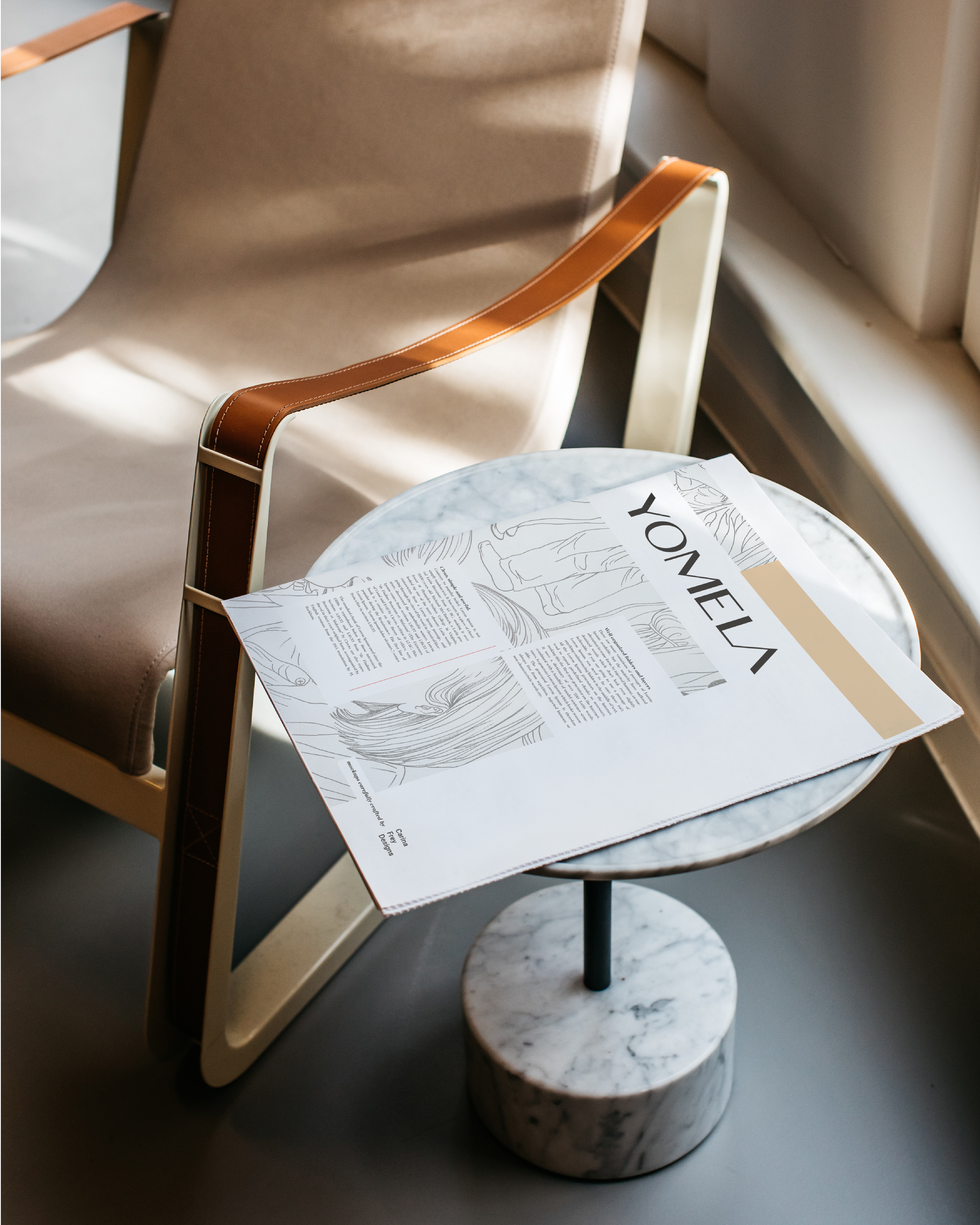
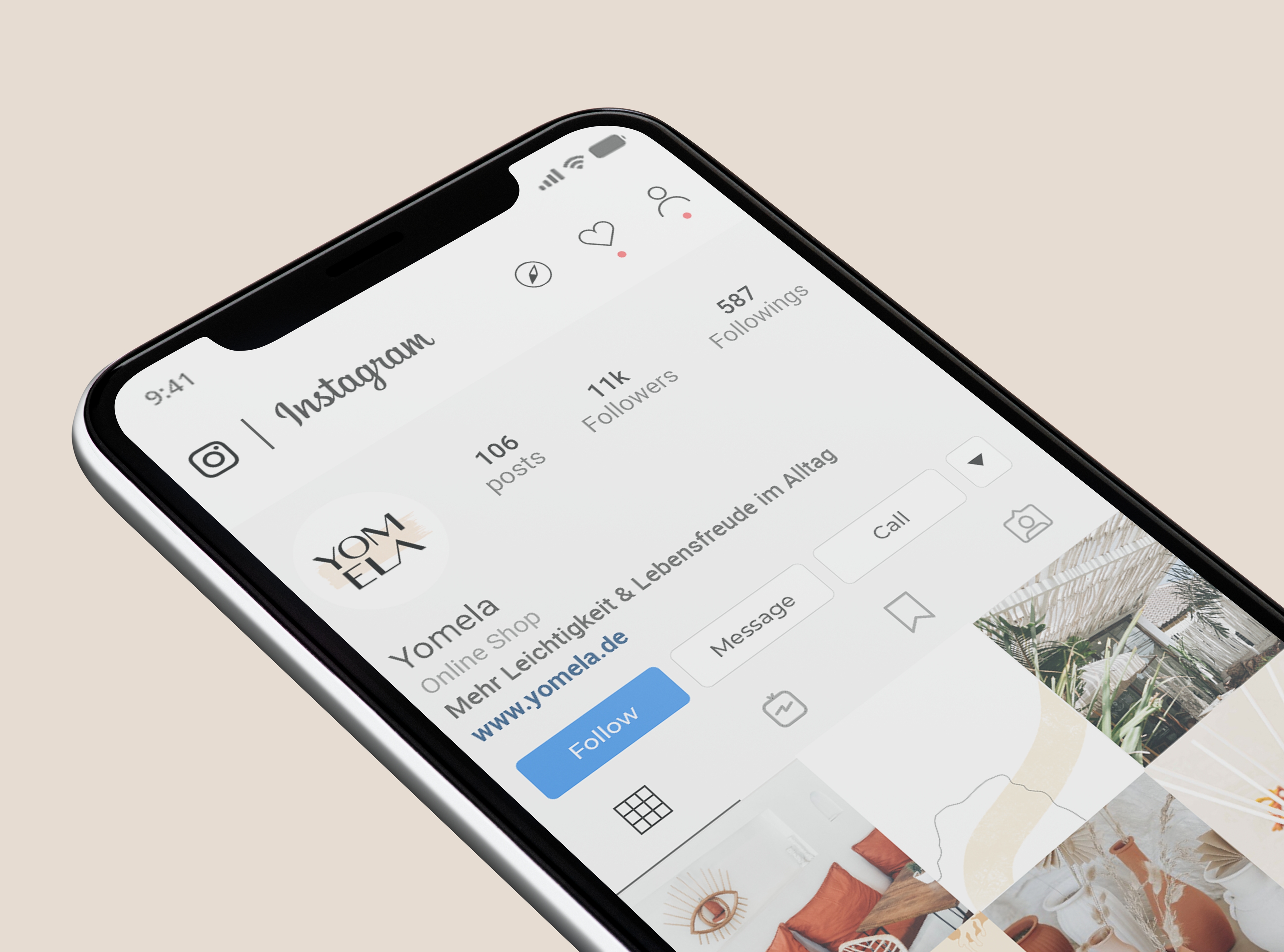
The primary logo consists solely of the brand type for which we chose a san serif typeface. San serif typefaces are a great choice for young startups, such as Yomela, that pursue a straightforward and clean look and feel. Through using all capital letters, we added a touch of boldness to it. As Yomela also aims at bringing people together virtually, such as through a blog, it became vital to integrate the aspect of relationship and community into the logo as well. Hence, I added a connection between the letters "L" and "A". Further, I drew various brush strokes in Procreate. Some of them as you can see above, we applied to the logo as alternatives. The other idea was that they could also be incorporated as an illustrative accent on their website. With that being said and done, Yomela was reborn - fresher and stronger than it has ever been.
When designing, I always keep in mind to make the brand relevant and relatable to the defined audience. Based on the previously established mood board concept, the direction we were heading into was very clear right from the beginning. With a minimalist yet soft approach, I developed a fresh identity, adding a set of graphic elements as part of the visual language to express Yomela's story and values. Mixing organic and geometric shapes, this aesthetic takes us to a place of mental peace, far away from outside distractions.


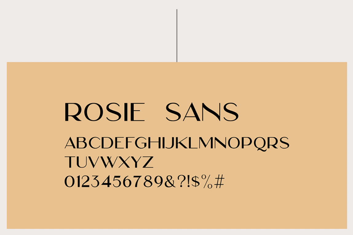
Primary Typeface
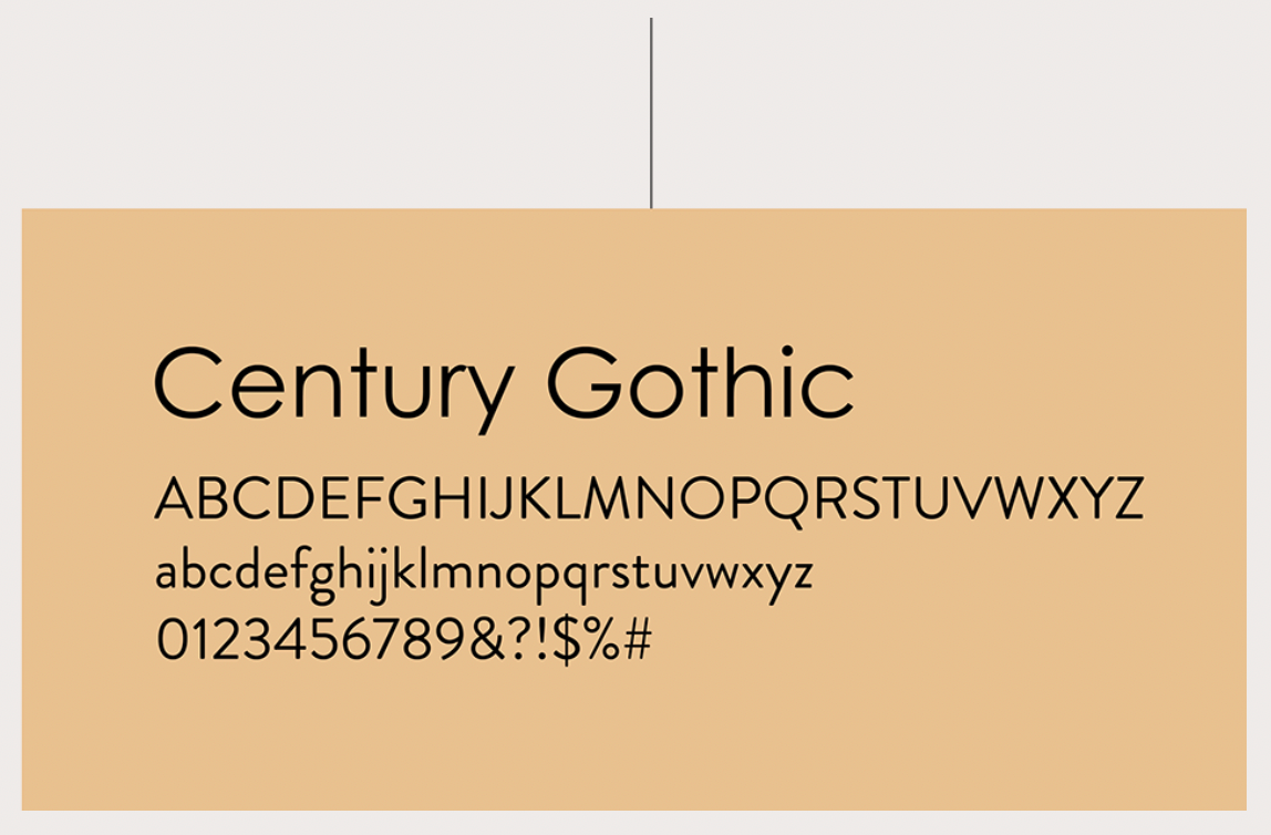
Secondary Typeface
Reflections
Yomela turned out to be my first experience with an e-commerce business that would offer a wide range of products and services online. I therefore had to approach the design process slightly different. The challenge was to bridge the gap of creating a visual identity that is minimal and bold at the same time. This being said, I did not only researched and analyzed their direct competitors but also retrieved inspiration from unrelated industries that too operate as an e-commerce business. I'm glad I did such extensive research. It really helped me gain a deeper understanding and come up with a concept that would be appropriate. Overall, it was such a fun and great experience working with the young Berlin based startup, Yomela.